Preview image. Unlock full-res
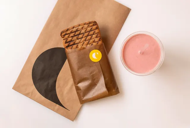
Overhead shot of a kraft paper takeaway bag carrying an oversized cropped C mark, a paper-wrapped toasted sandwich sealed with a yellow logo sticker, and a pink smoothie.
More like this
See all
Summary
A top-down packaging shot in which the brand mark appears twice at wildly different scales: huge and cropped on the kraft bag, tiny and circular as a sticker seal on the sandwich wrap.
Visual description
Shot straight down onto a warm off-white surface. A kraft paper bag sits at a slight diagonal, printed with a solid charcoal C mark so oversized that the counter of the letter runs off the left edge of the bag and the terminal tapers to a fine point near the bottom. Resting on top of it is a toasted, criss-cross grilled sandwich half wrapped in a brown paper sleeve; a small yellow circular sticker with the white C mark holds the sleeve closed. To the right sits a clear plastic cup of pale pink smoothie with a matching pink straw, shot flat so the foam surface reads as a solid disc of color. No typography is visible in the frame beyond the mark itself. Soft, near-shadowless daylight keeps the browns and the pink as the only warmth against the neutral ground.
Key takeaway
Scaling one mark from bleed-off-the-edge huge to sticker-small across the same order creates rhythm without adding a second graphic element. The kraft and brown paper do the heavy lifting so a single yellow dot is enough to signal the brand.
Reuse notes
A good reference for food and grocery packaging that wants to look natural without going rustic-cliche. Depends on genuinely uncoated stock and a mark with a strong silhouette that survives being cropped. Pairs with the color-blocked cup lineup from the same identity when you need a warm frame against a bright one.