
Preview image. Unlock full-res
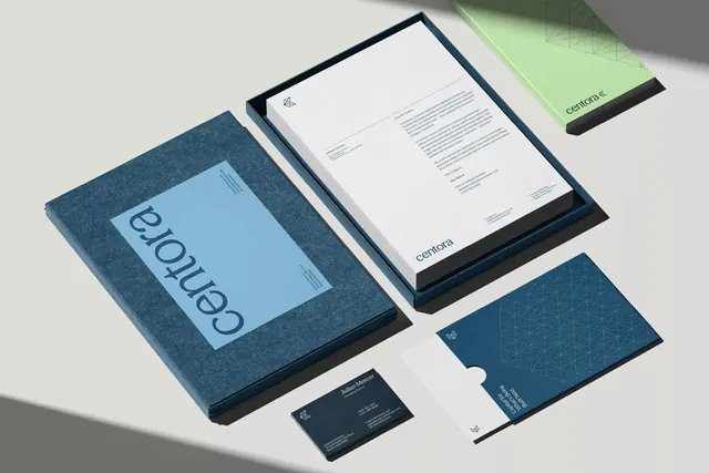
A multi-surface identity system using isometric illustration and a two-color palette of mint green and teal to render business collateral in architectural perspective.
Summary
A stationery system composed of three isometric planes rendered in pale mint green and deep teal, with a simple geometric logo (circle pierced by triangle) and ruled lines creating a cohesive, architectural brand language.
Visual description
Three rectangular forms overlap in isometric perspective, each a different depth. The left and bottom faces are mint green; the top-right face is cream white with the logo and three horizontal white lines representing body copy or rules. The center-left face, in dark teal, shows text placeholders as white lines. Borders are black line work. The logo itself nests a black triangle and circle together, legible and bold, occupying the upper portion of the cream face.
Key takeaway
The isometric view creates depth and visual interest on flat surfaces (business cards, letterhead) without photography or complex gradients. The logo's geometric economy (two shapes, one intersection) proves memorable. The color restraint (two primaries plus white and black) ensures consistency across mockups and printed applications.
Reuse notes
Ideal for consulting, tech, or creative services wanting sophistication without formality. The teal-and-mint combination skews fresh and approachable; monitor for warmth if a brand needs gravitas. Isometric layouts are strong on large formats (posters, environmental graphics) but risk becoming cluttered when scaled to 1-inch business cards.
More like this




Keep what you find
A free account saves references to boards and can send you a weekly email of picks based on what you save.
To see every result, go Pro.