Preview image. Unlock full-res
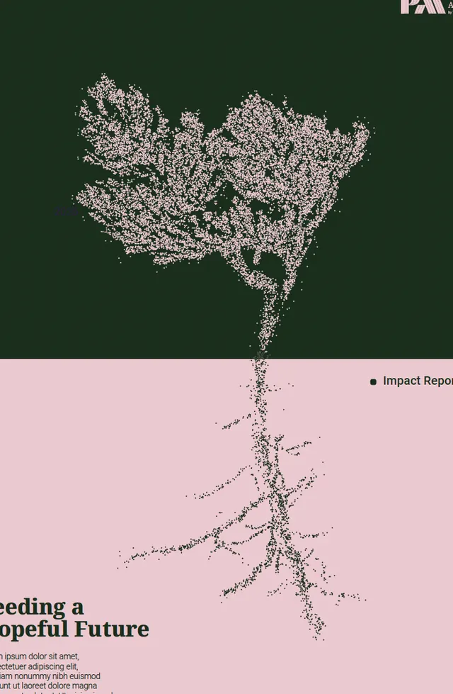
Editorial layout split vertically between a dense textured tree canopy (top, dark green) and fine root network (bottom, pale pink), with minimal text.
Summary
A vertical editorial layout pairing a dense textured tree canopy against forest green with a delicate root network on pale pink, communicating growth and ecological themes through nature symbolism.
Visual description
The composition divides the page into two halves: the upper half shows a tightly detailed, stippled silhouette of branching tree foliage rendered in off-white against a deep forest green, while the lower half mirrors the form downward into an intricate root system on a soft pink background. The contrast between canopy and root is both visual and conceptual, suggesting interconnection beneath the surface. Small text appears in the lower left corner (partially visible) in a light sans-serif. The design achieves its effect through negative space and texture rather than color variation.
Key takeaway
The vertical symmetry of roots-to-canopy as a visual metaphor for ecosystem balance and hidden depth. The textured, hand-drawn quality of the silhouette against flat color fields. The strategic use of just two color zones (green and pink) to create emotional separation while maintaining compositional unity.
Reuse notes
Strong for nonprofit, environmental, and healthcare branding that needs to communicate growth, sustainability, or wellness. Works well as an editorial spread or cover. The pale pink and forest green pairing is distinctive; avoid on backgrounds where legibility of the light silhouette would suffer.
More like this







Keep what you find
A free account saves references to boards and can send you a weekly email of picks based on what you save.
To see every result, go Pro.