Preview image. Unlock full-res
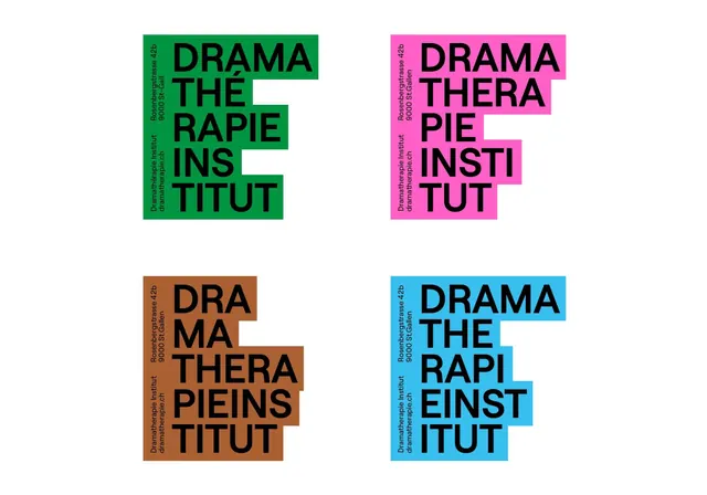
Typographic identity showing four color variations of a blocky all-caps sans-serif applied to an institutional name, using saturated green, magenta, orange-brown, and cyan.
Summary
Type specimen showing a therapeutic institute's institutional name rendered four times in a tight, blocky sans-serif with color-blocked background variations in green, magenta, orange-brown, and cyan.
Visual description
Four equal-sized specimen variations arranged in a 2x2 grid. Each iteration displays the all-caps text "DRAMA THE RAPIE INSTITUT" in bold black sans-serif (vertically stacked for tight composition), overprinted on a solid color rectangular block. The four color treatments are bright kelly green (top left), hot magenta (top right), warm burnt orange-brown (bottom left), and bright teal-cyan (bottom right). White space cuts through some of the letterforms where the colored blocks meet the edges, creating a fragmented, dynamic reading. Small vertical text along each block's edge repeats the name and address. The typography is condensed and geometric, prioritizing visual impact over readability nuance.
Key takeaway
The four-color variant system demonstrates institutional strength and flexibility. Each color block maintains similar visual weight despite different hues. The fragmented letterforms and color-cut-through technique creates visual tension and memorability, ideal for distinctive mark-making.
Reuse notes
Suitable for educational or therapeutic institutions seeking a confident, progressive identity. The four-color treatment works for guideline documents, signage, and environmental graphics. Pairs well with supporting institutional typography and minimal geometric layouts. The assertive primary colors suggest accessibility and modernity, not stuffy tradition.
More like this
Keep what you find
A free account saves references to boards and can send you a weekly email of picks based on what you save.
To see every result, go Pro.