Preview image. Unlock full-res
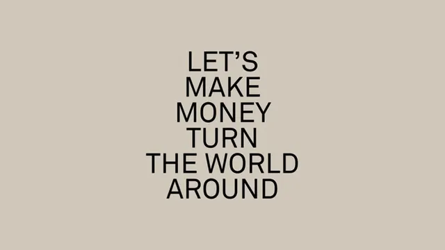
Centered, multi-line sans-serif headline in all-caps reading 'LET'S MAKE MONEY TURN THE WORLD AROUND' set on muted warm beige background, embodying direct financial brand positioning.
Summary
Fintech brand positioning statement: 'LET'S MAKE MONEY TURN THE WORLD AROUND' set in clean sans-serif all-caps display type, center-aligned and vertically stacked on warm neutral beige background.
Visual description
Single-color typographic composition with black sans-serif letters in large display weight, set center-aligned on a warm beige field. The text stacks in four lines, each justified to similar measure, reading as a confident manifesto. The letter shapes are geometric and open, without serifs or ornamental detail. The beige background is flat, creating stark contrast with the dark type. No imagery, no secondary elements, no decorative marks. The composition relies entirely on the weight and pacing of the type to communicate.
Key takeaway
This approach works for fintech or investment brands that want to signal conviction without hype: the blunt manifesto statement in clean sans-serif reads as serious and intentional rather than gimmicky. The neutral warm background (neither cool nor aggressive) softens the assertiveness of the all-caps type, balancing boldness with approachability.
Reuse notes
Useful for fintech, wealth-management, or marketing-focused brands seeking a direct, no-frills typographic statement. The all-caps treatment works best with relatively short messages (4-7 lines). The warm beige background is more forgiving than white and works equally well in pitch decks, posters, or digital backgrounds.
More like this




Keep what you find
A free account saves references to boards and can send you a weekly email of picks based on what you save.
To see every result, go Pro.