Preview image. Unlock full-res
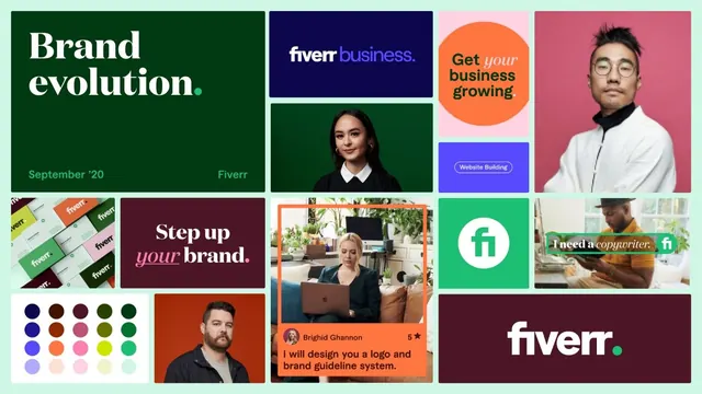
A modular identity system grid showcasing Fiverr's freelance marketplace branding across multiple color families and service touchpoints.
Summary
Fiverr brand system showcasing modular identity guidelines across dark green, navy, orange, and pink color families with service categories, portraiture, and product cards.
Visual description
A structured grid collage displaying Fiverr's brand identity system. Top-left: dark forest-green rectangle with white serif headline "Brand evolution" and teal subtext "September '20" and "Fiverr". Top-center: navy rectangle with white Fiverr wordmark in sans-serif. Top-right: bright orange circular badge with "Get your business growing" in black and italic white text. Top-far-right: pink background with portrait of person wearing white jacket and glasses. Middle-left: stacked product cards showing Fiverr business logos and materials. Middle-center: dark green portrait card of woman in professional attire. Center: burgundy rectangle with white serif "Step up" and magenta italic "your" and white "brand". Center-right: product showcase with orange frame border containing woman on laptop, rating stars, and testimonial text in white sans-serif. Far-right: green square with white "fi" icon, paired with person in yellow shirt. Bottom-left: color palette grid showing 25 swatches in organized rows: navy, brown, maroon, forest green, medium green, royal blue, burnt orange, hot pink, lime, lavender, light pink, pale yellow, mint. Bottom-center: burnt orange portrait. Bottom-right: burgundy rectangle with white Fiverr logo and green dot.
Key takeaway
Modular grid system organizing diverse brand assets (color palette, wordmarks, photography, service cards) into a cohesive visual reference. The palette range from cool navy and greens to warm oranges and pinks creates distinct zones while maintaining overall coherence. Typography hierarchy pairing large serif headlines with clean sans-serif body establishes clear information priorities.
Reuse notes
Reference for freelance marketplace or B2B service branding. Works well as a style guide template for multi-service platforms. Color blocking by quadrant allows testing of secondary color families without overwhelming the system. Portrait photography paired with product/UI cards demonstrates authentic, human-centered brand tone.