Preview image. Unlock full-res
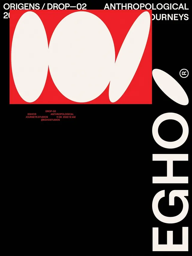
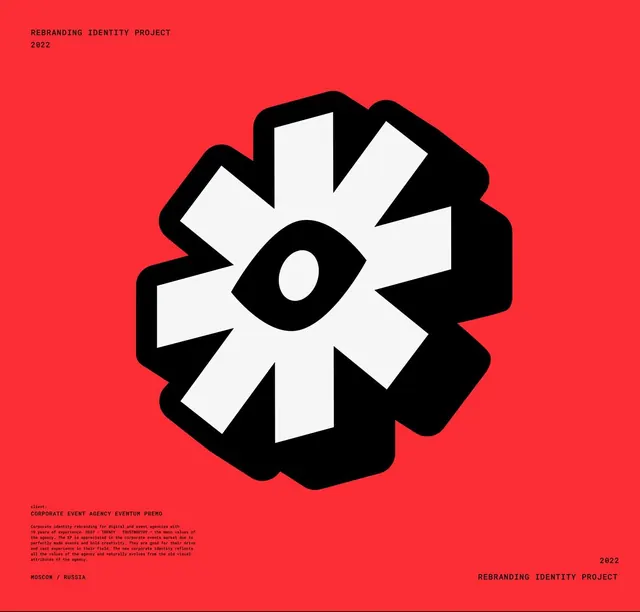
Bold geometric logo for a rebranding project featuring a stylized eye composed of white petals radiating from a central black iris on a vibrant red field.
Summary
A bold geometric logo for a corporate event agency rebranding that abstracts an eye as white petals radiating from a black iris, centered on a bright red background.
Visual description
Bright red background with a centralized geometric icon: a stylized eye composed of six white diamond-shaped petals radiating outward from a solid black oval pupil, creating a starburst or fan effect. The overall shape suggests both an eye and a blooming flower, balanced across vertical and horizontal axes. Small black text in the upper left reads "REBRANDING IDENTITY PROJECT / 2022"; below the icon, centered, is the client name "CORPORATE EVENT AGENCY EVENTUM PREMO" in all-caps sans-serif with a paragraph of small-print descriptive text. Bottom corners are labeled "MOSCOW / RUSSIA" (left) and "2022 / REBRANDING IDENTITY PROJECT" (right). The minimal three-color palette and stark contrast between red field and black-white mark create immediate visual impact.
Key takeaway
The radiating-petal eye reads as both symbol and mark at every scale, translating effortlessly from icon to signage. The 60-degree rotation of petals around a central focus creates dynamic movement despite the geometric simplicity. The three-color constraint (red, black, white) ensures no compromise on legibility and makes the mark boldly distinctive in crowded event-industry space.
Reuse notes
Ideal for agencies, event companies, or any brand that benefits from a forward-facing, confident presence. The central eye metaphor suggests observation, awareness, and presence. The high contrast and vibrant red work well on signage, digital, and merchandise. The petal-geometry scales from a small favicon to large architectural signage without losing definition. Works best as a primary mark without secondary complexity.