Preview image. Unlock full-res
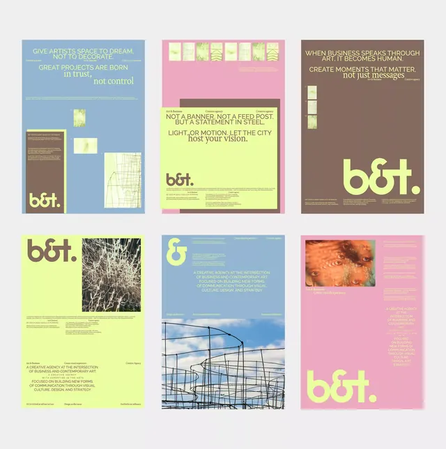
B&T identity system using a four-color palette with lime yellow, dusty pink, slate blue, and warm brown organized into distinct color blocks across stationery and collateral.
Summary
B&T is a color-blocked identity system using four distinct hues (lime, pink, blue, brown) as organizing zones across business applications, each color carrying related content.
Visual description
Six mockups arranged in a 2x3 grid, each a full-bleed color block (lime-yellow, dusty pink, slate blue, or warm brown) with minimal white space and sans-serif type set in the contrasting hue. Each mockup shows different applications: top-left is a blue card with lime and brown elements layered on it; top-center is a pink panel with lime-yellow sub-panel and dark text reading "b&t."; top-right is a brown poster with large lime logotype. Bottom row shows a lime sheet with photography inset, a blue poster with geometric line-drawing overlay, and a pink poster with burnt-orange image and lime wordmark. All layouts share centered or left-aligned text hierarchy, consistent use of a lowercase "b&t." mark, and a grid-based structure. The palette is warm and earthy with one acidic yellow pop.
Key takeaway
The four-color system where each color defines a separate application or content zone, creating visual cohesion without repetition. The pairing of oversized geometric shapes with tight typography. Using a single photostat or line-art element per mockup to add visual interest without cluttering the layout.
Reuse notes
Strong template for agency or creative-services branding where color differentiation aids navigation. The lime-pink-blue-brown combination works best on work targeting design-forward clients. Requires disciplined photo/illustration selection since each panel is so large and visible; avoid busy or overly detailed imagery.
More like this







Keep what you find
A free account saves references to boards and can send you a weekly email of picks based on what you save.
To see every result, go Pro.