Preview image. Unlock full-res
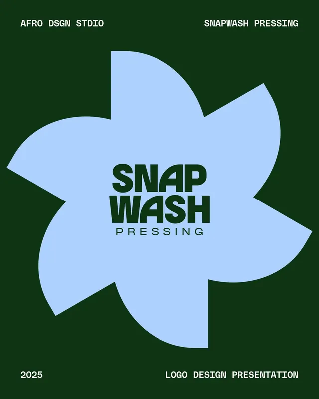
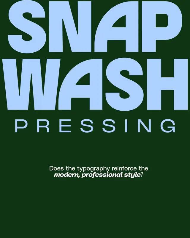
A high-contrast logo using oversized pale-blue stacked sans-serif wordmark against a deep forest green background, with a typography critique question below.
Summary
A consumer-brand logo using oversized pale-blue sans-serif set in stacked lines over dark forest green, with a reflected-mirror subtitle and a typography-critique caption.
Visual description
Pale, almost cyan-tinged blue sans-serif display type stacked into two lines: "SNAP" and "WASH" with roughly equal baseline widths. Letters appear to be geometric and slightly condensed, with generous internal counterspace. The "P" and "H" use distinctive angled cuts. Below in smaller, italic serif: "PRESSING" in the same blue. Dark forest green (#0F3413) fills the background. At bottom, centered: a metadata-style question in white serif asking "Does the typography reinforce the modern, professional style?"
Key takeaway
The complementary color contrast between cool pale blue and warm forest green creates immediate visual impact. The oversized stacked layout is both minimal and bold, letting letter forms carry the brand. The geometric character design (angled serifs, open counters) reads as contemporary without being trendy. The color pair feels unexpected for a laundry brand, elevating it beyond utility.
Reuse notes
Well-suited to service and consumer brands needing confidence without corporate rigidity. The high contrast works in small sizes (signage, app icons) and large formats (storefronts, social). The geometric type choice skews friendly and efficient, not corporate. Avoid if your brand identity centers on warmth or organic forms; the sharpness of the letter cuts and color pairing demand boldness.