Preview image. Unlock full-res
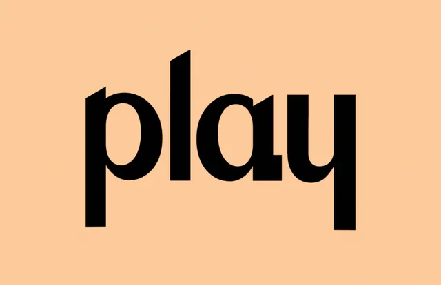
Lowercase sans-serif wordmark 'play' in heavy black type centered on a warm peachy-beige background with minimal framing.
Summary
A lowercase sans-serif wordmark centered on a warm peachy-beige field, demonstrating restrained, legible typography through weight and negative space alone.
Visual description
The word "play" is set in a heavy, geometric sans-serif with squared curves, rendered in pure black and centered within the frame. The background is a solid, warm peachy-beige (roughly 252/202/155 RGB). The entire composition is symmetrical and centered, with ample breathing room on all sides. The typeface shows consistent stroke weight throughout, with open letterforms (the 'p', 'l', 'a', 'y' all have clear interior space). No other elements, color variation, or decorative marks are present.
Key takeaway
The discipline of relying entirely on weight contrast and letter spacing to create presence without ornamentation. The warm, soft background humanizes the stark black type, making the palette feel friendly rather than cold. Use this pairing for wordmarks or display type aimed at creative industries.
Reuse notes
Strong reference for minimal brand identity work or type-forward campaigns. Works well for media, creative, or lifestyle brands seeking quiet confidence. The warm background prevents the high contrast from feeling harsh. Scale this approach when you need legibility and modern simplicity without sans-serif cliches.
More like this

Keep what you find
A free account saves references to boards and can send you a weekly email of picks based on what you save.
To see every result, go Pro.