Preview image. Unlock full-res
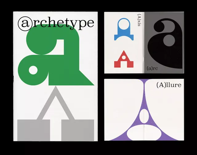
A modernist type system named Archetype, combining bold geometric letterforms with abstract symbols and a structured grid-based visual language.
Summary
A modernist type system named Archetype, combining bold geometric letterforms with abstract symbols and a structured grid-based visual language.
Visual description
Four modular compositions arranged in a 2x2 grid, each with distinct geometric marks and letterforms. Top-left shows the "Archetype" wordmark set in a custom serif with a thin circular @ symbol above it, paired with geometric forms in green and gray below. Top-right displays abstract symbol mark combinations on dark gray and black backgrounds, including a blue arch symbol and red triangle. Bottom-left features angular gray chevron and triangle shapes stacked vertically. Bottom-right shows a large purple downward-pointing chevron mark split symmetrically with white negative space, labeled "(A)llure". All compositions use clean lines, geometric shapes, and careful negative space alignment.
Key takeaway
The modular, four-panel presentation showcasing a complete identity system; the use of negative space within geometric forms to create distinctiveness; the restraint of a minimal color palette (black, grays, forest green, purple, red) to unify diverse marks.
Reuse notes
A reference for developing cohesive geometric type systems or corporate identity mark languages. Works well for design studios, tech brands, or luxury goods where precision and intellectual rigor signal quality. Best applied when designing a modular mark family rather than a single logo.
More like this




Keep what you find
A free account saves references to boards and can send you a weekly email of picks based on what you save.
To see every result, go Pro.