Preview image. Unlock full-res
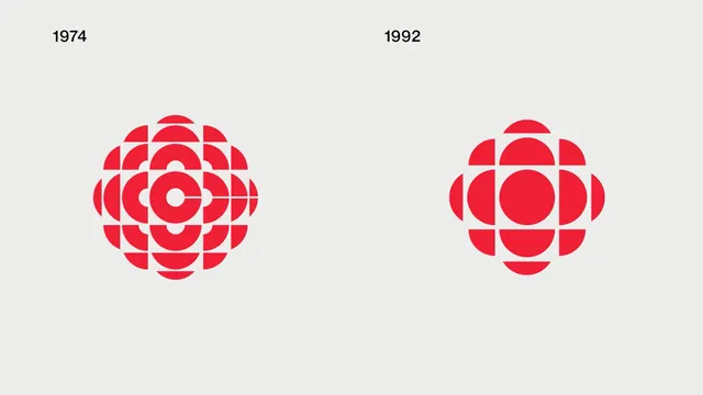
A side-by-side comparison of two iterations of a red segmented circular logo from 1974 and 1992 on a light gray background.
Summary
A paired comparison of a red segmented circular logo mark from 1974 and 1992, displayed on a light gray background with year labels above each iteration.
Visual description
Two identical-sized red geometric logos on a light gray field, each made of segmented quarter-circle arcs arranged in a 4x4 grid pattern with a central void. The left logo (1974) features tighter, more complex interlocking segments, while the right logo (1992) uses a simpler, more open construction with a larger central circle. Year labels in sans-serif sit above each mark. The red is a consistent bright crimson throughout.
Key takeaway
The two iterations show gradual simplification of a modular geometric system: maintaining the circular grid concept while reducing visual density and improving clarity. This illustrates refinement over 18 years without abandoning the brand's core visual identity.
Reuse notes
Strong reference for showing brand evolution to stakeholders, or for demonstrating how geometric logo systems can evolve while staying recognizable. Works well in annual reports, design case studies, and brand history documents.
More like this



Keep what you find
A free account saves references to boards and can send you a weekly email of picks based on what you save.
To see every result, go Pro.