Preview image. Unlock full-res
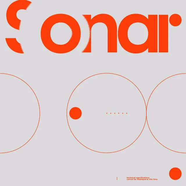
A lowercase orange Sonar wordmark with a stylized S logomark above three large outlined circles and a small caption, all on a light grey ground.
Summary
A Sonar identity built around a rounded lowercase wordmark, a custom S logomark with a sprayed broken edge, and three large monoline circles that echo a sonar ping.
Visual description
On a light warm-grey ground the word sonar runs across the top in bright orange, set in a soft rounded geometric sans with wide o, n, and a counters. To its left a separate S logomark is rendered as two stacked curved strokes with a frayed, spray-textured edge that breaks up the otherwise clean forms. Below, three large thin-stroke outlined circles span the width and slightly overlap; one holds a small solid orange dot at its left edge and a short row of tiny dots at its center, suggesting a radar blip. A small all-caps caption sits at the lower right beside a thin vertical rule. Everything stays in a tight orange-on-grey palette.
Key takeaway
Pairing a clean rounded wordmark with one deliberately distressed element, the sprayed S, so the system has a single point of texture and personality against an otherwise crisp grid. The overlapping monoline circles double as a literal concept cue (sonar pings) and as a flexible background device.
Reuse notes
A strong template for a tech, audio, or developer-tool brand that wants warmth without going corporate-blue. The thin circles and dot motifs extend easily into patterns, loaders, or icon sets. The orange-on-grey contrast is comfortable; keep the sprayed texture rare so it stays a feature, not noise.
More like this




Keep what you find
A free account saves references to boards and can send you a weekly email of picks based on what you save.
To see every result, go Pro.