Preview image. Unlock full-res
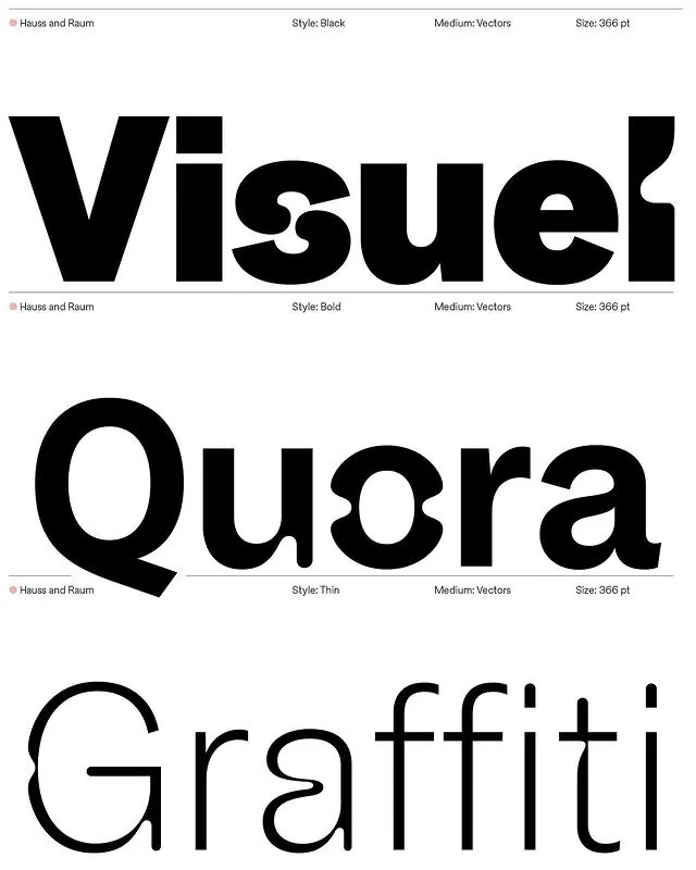
Three weight variants (Black, Bold, Thin) of a geometric sans-serif typeface in stacked rows, demonstrating stroke thickness variation and optical adjustment.
Summary
Three variations of Hauss and Raum typeface in Black, Bold, and Thin weights set in all-caps, demonstrating proportional optical adjustment across weight extremes.
Visual description
White background displaying three typeface treatments stacked vertically. Top: "Visuel" in heavy Black weight with thick, robust letterforms and rounded stroke terminals. Small gray metadata above reads "Hauss and Raum, Style: Black, Medium: Vectors, Size: 366 pt". Middle: "Quora" in Bold weight with medium-thickness strokes, showing geometric proportions and open counters. Gray metadata: "Hauss and Raum, Style: Bold, Medium: Vectors, Size: 366 pt". Bottom: "Graffiti" in Thin weight with delicate hairline strokes and generous letterspaceing. Gray metadata: "Hauss and Raum, Style: Thin, Medium: Vectors, Size: 366 pt". All type rendered in pure black on white, set in capitals. Geometric sans-serif character throughout with subtle contrast between vertical and curved strokes. Each word showcases the weight's distinctive optical properties: heavy version feels authoritative and grounded, bold version balances presence and readability, thin version appears refined and contemporary.
Key takeaway
Multi-weight typeface system with consistent geometry across extremes from 1000 to 100 weight. Optical adjustments visible in letter spacing and counter size maintain readability despite stroke variation. All-caps setting emphasizes geometric character of the font. Pure black-on-white presentation allows focus on typographic detail without color distraction.
Reuse notes
Ideal reference for typeface families designed across multiple weights, or for headlines and branding requiring weight flexibility. Works well for systems emphasizing precision and clean geometric design. Heavy weight commands attention for logos; bold suits signage; thin adds sophistication to body-adjacent display usage. Vector-based construction ensures scalability. Suits tech, design, or corporate branding requiring modern, legible geometric type.