Preview image. Unlock full-res
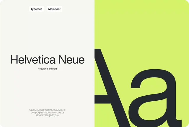
Type specimen for Helvetica Neue split across a neutral left panel and vibrant lime green right panel, with a large specimen character and full character set.
Summary
A Helvetica Neue type specimen dividing neutral documentation on the left from a vibrant lime-green character display, with weight/style labeling and full character set shown below.
Visual description
The left half of the layout sits on cream white and lists "Typeface" and "Main font" labels with "Helvetica Neue" and "Regular / Semibold" specifications. Below is a full character set (upper and lowercase, numbers, punctuation) set in light gray. The right half commands the space with a bright lime-green background (#D5F16D) displaying a large black "a" character, its generous size and sans-serif geometry anchoring a bold, confident visual statement. The contrast between the restrained documentation side and the expressive display side creates hierarchy and guides the eye to the hero character.
Key takeaway
The split-screen structure separates specimen documentation from display typography, letting each serve its purpose cleanly. The high-contrast character treatment (bold black on neon green) makes the typeface's form unforgettable without being garish. Using a single letter at scale is more powerful than showing multiple weights or sizes crammed together.
Reuse notes
Ideal for modernist identity systems and tech-company type specifications. Works well when the typeface itself is the subject, not the brand. The lime green can be substituted for any high-contrast accent color; this approach stays clean even with muted palettes.
More like this


Keep what you find
A free account saves references to boards and can send you a weekly email of picks based on what you save.
To see every result, go Pro.