Preview image. Unlock full-res
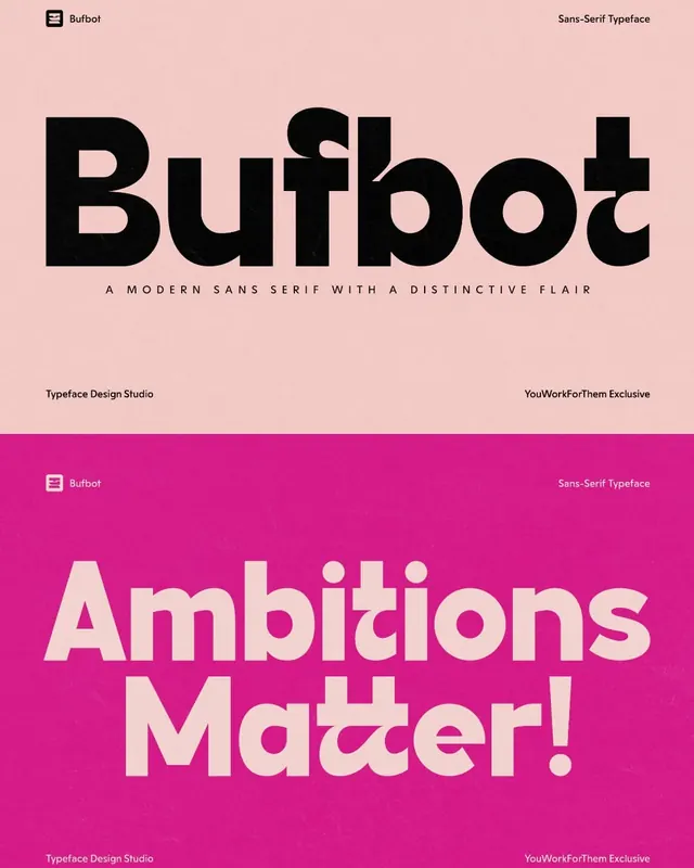
A split-screen specimen showcasing Bufbot, a geometric sans-serif with rounded terminals and distinctive letterforms, split across blush-pink and vibrant-magenta backgrounds to demonstrate versatility and boldness.
Summary
A typeface specimen for Bufbot, a contemporary geometric sans-serif, split vertically across contrasting blush-pink and bold magenta backgrounds to showcase the font's character and adaptability in high-impact settings.
Visual description
Two equal vertical panels demonstrate Bufbot's versatility. The upper blush-pink panel displays "Bufbot" in large black letterforms with distinct characteristics: rounded bowl curves, geometric proportions, and subtle friendly details in the letterforms. Below the nameplate sits the descriptor "A MODERN SANS SERIF WITH A DISTINCTIVE FLAIR" in smaller caps, and supporting text reads "Typeface Design Studio" and "YouWorkForThem Exclusive" in corners. The lower magenta panel inverts the color logic, setting "Ambitions Matter!" in large cream-white letterforms at approximately the same scale. The same corner credits repeat. The two-panel layout demonstrates the typeface's suitability for both dark-on-light and light-on-dark usage while the vibrant color shift emphasizes contemporary boldness. The geometric character of the type remains clear across both backgrounds.
Key takeaway
The split-screen presentation elegantly solves the problem of showing contrast usage without requiring two separate specimens. The geometric sans-serif construction with rounded terminals balances modern simplicity with friendly personality. The magenta-and-pink color combination is distinctive and memorable, and creates visual excitement around a relatively straightforward type display.
Reuse notes
Effective for ambitious creative brands, startups, or any identity embracing color and contemporary type. The typeface's geometric nature and rounded terminals make it excellent for display use and branding headlines. The color-blocked specimen format works particularly well for websites, physical type specimens, or promotional materials. The typeface pairs well with minimalist layouts where it can serve as the dominant visual element. Less suitable for body copy applications due to the display nature; works best at headline scale and larger.
More like this

Keep what you find
A free account saves references to boards and can send you a weekly email of picks based on what you save.
To see every result, go Pro.