Preview image. Unlock full-res
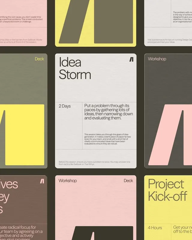
Modular system of muted-palette type specimen cards arranged in a loose grid, documenting workshops (Idea Storm, Project Kick-off) with body copy and design methods.
Summary
A type and layout specimen showing workshop cards (Idea Storm, Project Kick-off, others) in a restrained three-color palette of ochre-yellow, soft pink, dark olive, and light cream, with body copy and methodology text on modular card forms.
Visual description
A grid of rectangular cards, most in portrait orientation, each approximately the same width. Left column: solid color backgrounds (olive-green, yellow-ochre, soft pink) with white or dark sans-serif text labeling the activity (Deck, Workshop, Project Kick-off). Center card: dominant white field with large "Idea Storm" headline in a dark sans-serif font, followed by "2 Days" and descriptive paragraph text. Right column: additional cards, some with labels only, some with background color blocking (parallelogram shapes in yellow and pink). Color palette limited: five main hues across the entire grid, applied consistently. Typography strictly sans-serif throughout, with clear hierarchy between labels and body copy. The modular system allows cards to snap together in different arrangements while maintaining visual coherence.
Key takeaway
The color palette is emotionally warm and professional without being loud; it reads as friendly to people new to design while signaling rigor to practitioners. Each card is a self-contained module yet the color threading unifies the whole system. The parallelogram/skewed shapes in the color fields add movement without betraying the minimal aesthetic. The typography treatment (oversized labels, tighter body text) makes the hierarchy obvious at a glance, essential for instructional material.
Reuse notes
This system works beautifully for design workshop curricula, agile methodology documentation, or educational institutions where the audience is designers or creative professionals. The palette reads as European and contemporary. Avoid for fast-moving, consumer-facing campaigns where this restraint would feel slow; this is best for long-form education materials that will be studied, not scanned. Scale this grid fluidly to fit any number of workshops without changing the system.
More like this



Keep what you find
A free account saves references to boards and can send you a weekly email of picks based on what you save.
To see every result, go Pro.