Preview image. Unlock full-res
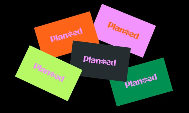
Five scattered rectangles on black, each carrying the Planted wordmark whose T is replaced by the tree symbol.
More like this
See all

Summary
A wordmark colourway study laid out as five loosely stacked cards, each pairing a different background with a different logotype colour.
Visual description
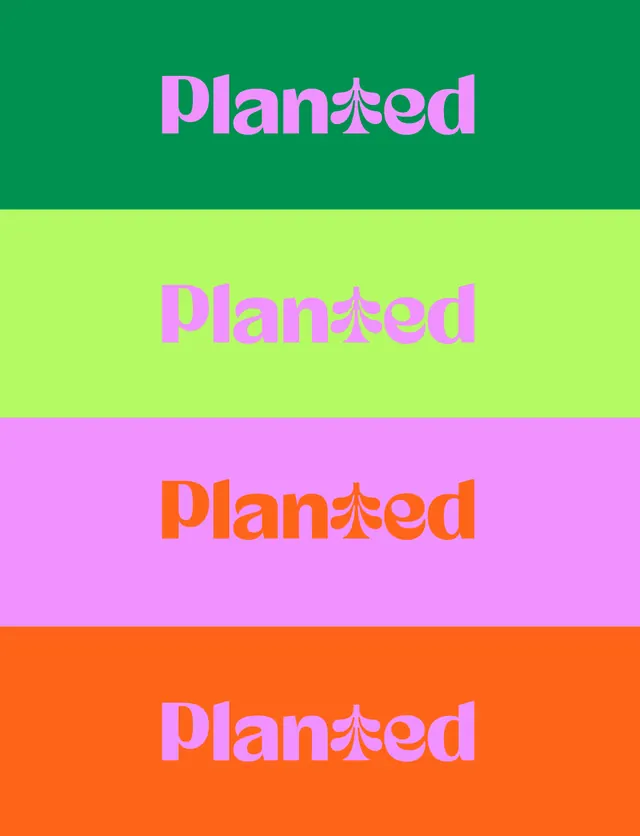
Five landscape rectangles are rotated at shallow, varied angles and overlap slightly on a pure black ground, one at each corner and one across the centre. Backgrounds are orange, lilac, lime, dark charcoal navy and green. Each carries the Planted wordmark set in a tight, heavy geometric sans with wide round bowls and a very short descender on the p. The T of the word is replaced by the brand tree symbol, its trunk acting as the stem and its outer lobes as the crossbar, so the substitution is legible without slowing the read. Logotype colours are lilac on orange, orange on lilac, lilac on lime, lilac on charcoal and lilac on green, so lilac carries four of the five pairings.
Key takeaway
Substituting a letter with the symbol removes the need for a separate mark and wordmark lockup. Testing every background against the same accent colour, here lilac, is a fast way to prove a palette holds together before any application work starts.
Reuse notes
Good reference for presenting logotype flexibility early in a project, and it doubles as a stationery or card concept. The lilac accent is doing the unifying work, so a palette without one dominant accent will look scattered in this layout. Check the substituted glyph at small sizes, since the tree loses its lobes before the rest of the word loses legibility.