Preview image. Unlock full-res
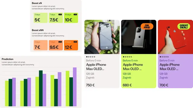
A flat-lay of Dealio app UI pieces: two tiered boost-pricing panels, a color-coded bar chart, and three phone listing cards in different accent colors.
More like this
See all


Summary
A composed sheet of product UI showing how the brand's accent colors do the work of hierarchy: greens for one boost tier, oranges for another, and a different accent per listing card.
Visual description
White canvas split loosely into a left column of two panels and a right row of three cards. Top left, a light grey rounded panel titled "Boost xN" over two lines of grey placeholder copy, then three rounded tiles in ascending green saturation labeled "3 days / 5 EUR", "7 days / 7.5 EUR" and "14 days / 10 EUR"; the second and third carry a small black "-20%" pill in the top-right corner. Directly below, the same pattern repeats as "Boost xNN" in a peach-to-orange ramp at 7, 9.5 and 12 EUR. Duration labels are small and set in the tile's darker tint; prices are large and black. Lower left, a "Prediction" panel holds a bar chart of six triplets on faint horizontal gridlines, each triplet cycling lime, dark forest green and lavender, with no axis labels. Right side: three phone-listing cards of equal size. Each has a square photo of an iPhone on top, then a five-dot pagination indicator with the first dot filled, a muted "Before 0 min" timestamp, a two-line black product title, "128 GB", "Zagreb", and a large price. The first card sits on light grey at 750 EUR, the second on lime at 680 EUR with an orange "ON FIRE!" pill on the photo, the third on lavender at 700 EUR with a lime "GREAT DEAL!" pill.
Key takeaway
The color system doubles as the pricing system: each boost tier gets its own hue ramp, so a user reads relative value before reading a number. Repeating the promo badge as a rotated pill in the photo corner, in a color borrowed from a different card, keeps the grid lively without adding a new element.
Reuse notes
Useful when designing paid-promotion or listing-upgrade flows in a marketplace, or any place where tiers need to feel like a ladder rather than a table. The full-bleed card backgrounds only work if every accent stays legible with black text, so it does not transfer directly to a dark theme. Note the copy here is lorem ipsum placeholder.
More like this



Keep what you find
A free account saves references to boards and can send you a weekly email of picks based on what you save.
To see every result, go Pro.