Preview image. Unlock full-res
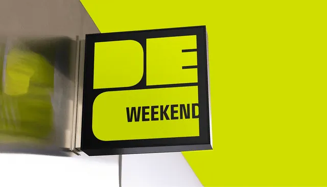
Photographic mockup of a black-framed projecting sign carrying the acid-yellow DEC Weekend lockup on a matching color wall.
More like this
See all
Summary
A square projecting sign mounted flat to a wall, its acid-yellow face carrying the DEC monogram with the word WEEKEND dropped into the open counter of the C.
Visual description
The sign sits slightly left of center, a shallow black box seen at an angle so its side depth and the two thin mounting brackets are visible. The face is a flat acid yellow-green with the monogram cut out in black: a wide D and E stack across the top, the C below opened up so the black word WEEKEND sits inside its counter as a single condensed all-caps line. Behind the sign the wall splits diagonally, white on the lower left and the same acid yellow on the right, so the sign reads against both. A brushed metal surface and a soft yellow reflection blur out of focus on the far left, and a thin cable drops from the bottom of the sign to the floor.
Key takeaway
Using the counter of a letterform as the slot for the sub-brand word means the sub-brand never needs its own lockup or its own space. Matching the wall color to the sign face turns the environment into part of the identity rather than a backdrop.
Reuse notes
Useful when presenting an identity that has to work at small physical scale and needs one hero application shot. The trick relies on very wide letter counters and a single short sub-brand word; longer words will crowd the counter and break the fit.