Preview image. Unlock full-res
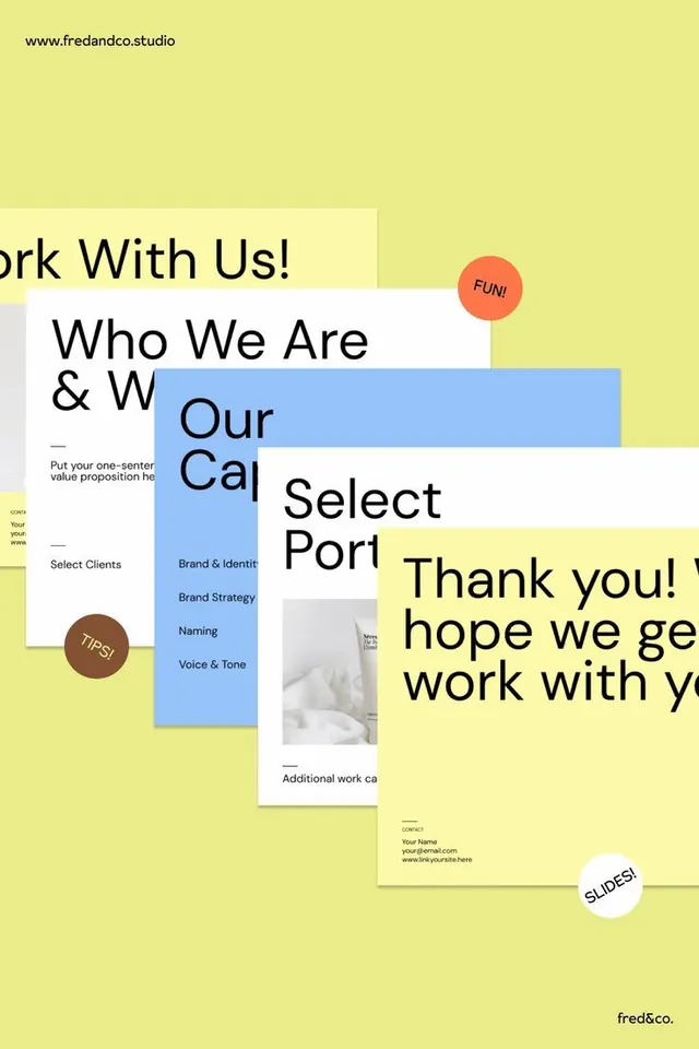
An overlapping collage of branding agency deck slides on bright yellow background showing service offerings, process sections, and contact information in a playful, layered composition.
Summary
A Fred & Co. branding agency portfolio composition showing staggered deck slides with service categories (Brand & Identity, Brand Strategy, Naming, Voice & Tone), call-to-action sections, and contact details arranged in playful depth across a bright yellow field.
Visual description
Multiple rectangular slide cards in white and light cream are layered and offset across a vibrant pale yellow background. Key slides visible include "Work With Us!" with text prompt, "Who We Are & What We Do" section with "Our Capabilities" in a light blue panel, "Select Portfolio" column, "Thank you! hope we get to work with you" closing message, and a contact card with "Your Name" and email/website fields. Orange speech bubbles label sections as "FUN!" and "TIPS!" in a casual, conversational tone. A brown circular badge emphasizes "TIPS!" placement. The typography is clean sans-serif in black, sized hierarchically. The layering creates apparent depth without shadows, relying on offset positioning and varied card widths to suggest dimension.
Key takeaway
The yellow background is bold enough to unify disparate slides without needing a rigid grid; the color does the structural work. Layering flat cards at different angles and depths creates visual interest and guides the eye through content without overwhelming it. The speech bubbles and circular badges add personality and break up what could be a formal presentation, making the agency feel approachable. Using one supporting color (light blue) alongside the warm yellow holds the palette tight while adding contrast for key sections.
Reuse notes
Effective for agency or consulting portfolio mockups where you want to show multiple service offerings at once without formal hierarchy. The playful offset stacking reads as confident and modern, not chaotic. Best suited to brands targeting creative sectors (design, marketing, consulting) that value personality over corporate restraint. The bright yellow works when paired with strong sans-serif type and clean white space; can feel juvenile if the typography is too light or the content too sparse.
More like this



Keep what you find
A free account saves references to boards and can send you a weekly email of picks based on what you save.
To see every result, go Pro.