Preview image. Unlock full-res
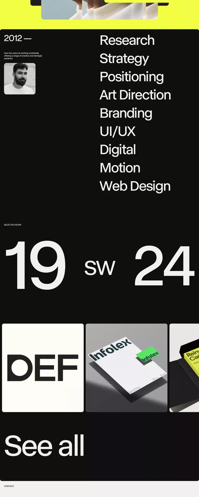
JARCOS design studio brand with modular black-and-white grid layout punctuated by high-impact yellow, pairing sans-serif type with geometric visual structure.
Summary
JARCOS design studio brand with modular black-and-white grid layout punctuated by high-impact yellow, pairing sans-serif type with geometric visual structure.
Visual description
A vertical brand presentation showing a modular grid system. The layout is divided into modules using black lines and white space. Yellow blocks act as visual accents, breaking the monochrome palette with high-saturation contrast. The wordmark "JARCOS" appears in clean sans-serif at top and bottom. The interior shows service labels (Research, Strategy, Positioning, Art Direction, Branding, etc.) and date markers (19 SW 24), product photographs in small square frames, and the contact email "hi@jarcos.work". The overall aesthetic is flat, contemporary, and architectural, relying on geometric division and negative space rather than illustration.
Key takeaway
The precise use of one accent color (yellow) as a compositional anchor in an otherwise monochrome system. The modular grid creates rhythm without ornament. The small documentary photographs in fixed squares feel like a filing system or archive, reinforcing professional competence.
Reuse notes
Strong reference for creative agencies, design studios, and consulting firms. The yellow reads as energetic and modern against the austere black/white. Works best when the service list is genuinely differentiating (here: Art Direction, Positioning, rather than generic "Web Design"); tailor the modules to what you actually do.
More like this






Keep what you find
A free account saves references to boards and can send you a weekly email of picks based on what you save.
To see every result, go Pro.