Preview image. Unlock full-res
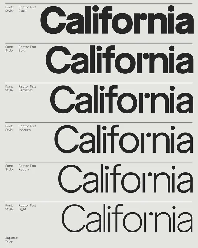
Six-weight type specimen for Raptor Text displaying the word 'California' from Black to Light, with clean label spacing and horizontal dividers.
Summary
Six-weight type specimen for Raptor Text displaying the word 'California' from Black to Light, with clean label spacing and horizontal dividers.
Visual description
Six rows of horizontal black sans-serif type on a light gray background, each row showing 'California' in a single weight. Left margin labels (Font: Raptor Text, Style: Black/Bold/SemiBold/Medium/Regular/Light) are set in small sans-serif with consistent spacing. Thin horizontal lines separate each weight sample, creating a grid-like structure. Type size increases and stroke weight decreases from top to bottom, visually emphasizing the contrast between heavier and lighter weights. The layout is vertically centered with balanced whitespace. At bottom, "Superior Type" is credited in light gray.
Key takeaway
The methodical side-label approach that documents weight names without cluttering the specimen itself. The consistent row height and horizontal divider system makes weight comparison immediate and legible. Use this structure for any multi-variant type display (widths, styles, optical sizes).
Reuse notes
Ideal reference for foundry specimen design or documenting font families with multiple weights. Works equally well in print or digital. The light background and dark type is accessible and timeless for technical documentation.
More like this








Keep what you find
A free account saves references to boards and can send you a weekly email of picks based on what you save.
To see every result, go Pro.