Preview image. Unlock full-res
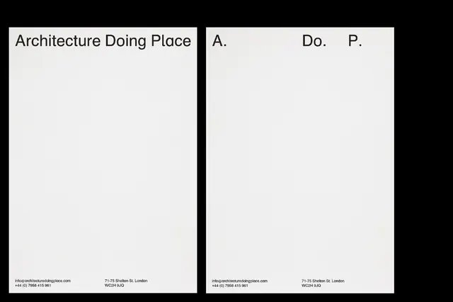
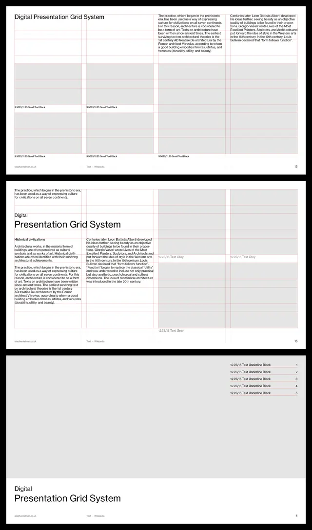
Minimalist architecture identity system with stark black-and-white card layout and refined sans-serif typography, split into organized content sections.
Summary
Architecture Doing Place is a Swiss-design identity system using stark white and black cards with hierarchical sans-serif typography and asymmetric grid layout.
Visual description
Three-card layout photographed as a flat arrangement. Left card with bold black header text reading "Architecture Doing Place | A" followed by small sans-serif meta-text in lighter weights; center card spans full height, white with black border frame, containing minimal content; right card continues the branding system with smaller type scales. Gutters and white space are structural; all type is left-aligned sans-serif in varying weights (likely a single family). No imagery, illustration, or color. The composition resembles a business-card or stationery system proof sheet, emphasizing typographic hierarchy and restraint.
Key takeaway
Relentless use of negative space as structure; the serif/sans mix is avoided entirely for maximum clarity; card-based presentation makes the identity system feel tangible and systematic; refined type hierarchy using weight and scale instead of color; this aesthetic reads as confident and academically rigorous rather than trendy.
Reuse notes
Ideal for architecture, design studios, or portfolio work targeting institutional or creative-professional clients. Works well when your brand story is told through typography and composition rather than illustration or vibrant color. Feels at home in print (business cards, letterpress) as much as digital.
More like this






Keep what you find
A free account saves references to boards and can send you a weekly email of picks based on what you save.
To see every result, go Pro.