Preview image. Unlock full-res
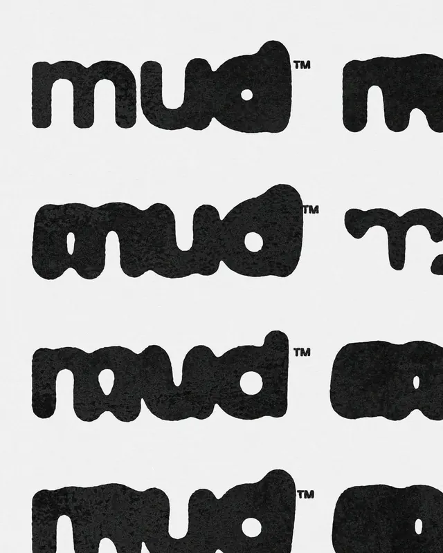
Four stacked iterations of the word 'mud' rendered in heavily textured, organic display typeface with visible grain, voids, and irregular stroke edges.
Summary
Type specimen showing four versions of 'mud' in a heavily textured display font with visible grain, cut-outs, and organic stroke irregularities on a light background.
Visual description
Four stackings of the word 'mud' each rendered in a chunky, blackletter-influenced display typeface with pronounced surface texture. Each letterform contains interior voids (cut-outs) positioned asymmetrically: the first and third rows have void shapes positioned in the center or off-center of individual letters, creating a rhythm of negative space. The type appears to be printed or rendered with visible grain and paper texture, suggesting either a grunge effect, halftone overlay, or intentionally worn digital aesthetic. Each row sits on a neutral light gray baseline. The overall effect is tactile and raw, emphasizing the weight and form of the letter shapes against their texture.
Key takeaway
The void-cutting technique within letter geometry creates interest without adding color or secondary elements. The grain texture overlay feels authentic rather than digital, making heavy, bold type feel approachable and expressive. Repeating the wordmark with slight variation in void placement creates a simple type system that hints at versatility without requiring multiple font weights.
Reuse notes
Useful for gritty, youthful, or rebellious brands that need personality without fussiness. Works well in poster, packaging, or editorial contexts where print texture enhances the message. The monochromatic treatment ensures legibility across scales; avoid overly complex backgrounds that would compete with the type's internal texture.
More like this


Keep what you find
A free account saves references to boards and can send you a weekly email of picks based on what you save.
To see every result, go Pro.