Preview image. Unlock full-res
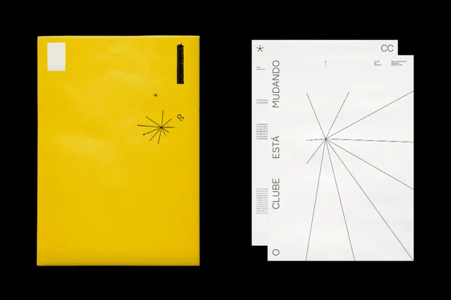
Two-panel Swiss modernist editorial design pairing a solid golden-yellow left panel with a white right panel featuring concentric radial line diagrams and vertical typographic labels.
Summary
A Swiss modernist editorial spread split into two contrasting panels: a solid golden-yellow left side and a white right side featuring concentric radial line diagrams with vertically-set descriptive text labels aligned to a strict grid.
Visual description
The design is a landscape-oriented spread photographed against black, creating two distinct halves. The left panel is a solid golden-yellow rectangle containing minimal composition: a small white rectangle and a thin black vertical line in the upper left, plus a centered radiating starburst made of thin black lines. The right panel is off-white with a systematic typographic layout. Thin black lines radiate from the center in all directions, creating concentric geometric rings. Text is set vertically along the left and right edges in a compact sans-serif (likely Helvetica), reading as category labels or metadata. A white rectangle in the top-right corner contains black text. The overall impression is precise, architectural, and data-driven.
Key takeaway
The power of complementary color contrast to create distinct hierarchy without images or illustration. The radial diagram becomes a visual metaphor for systematic thinking or information expansion. The grid-based composition proves that dense information can feel calm and organized when constrained to geometric rules. Yellow-on-white/yellow-on-black pairings are rare in editorial work and immediately distinctive.
Reuse notes
Ideal for architecture, urban planning, scientific publishing, or branding systems that require communicating process and structure. The diptych layout works for before/after, concept/execution, or theory/application narratives. Requires quality typography to succeed; poor kerning will undermine the precision. Less suitable for marketing or lifestyle contexts; best for professional audiences that value analytical clarity.
More like this






Keep what you find
A free account saves references to boards and can send you a weekly email of picks based on what you save.
To see every result, go Pro.