Preview image. Unlock full-res
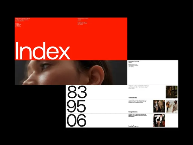
Editorial design system anchored by a vivid red header band containing oversized white 'Index' type, flowing into asymmetric black-and-white sections with portrait photography and numerical labels.
Summary
Editorial design system anchored by a vivid red header band containing oversized white 'Index' type, flowing into asymmetric black-and-white sections with portrait photography and numerical labels.
Visual description
A horizontal layout with a dominant red band across the top containing small white metadata text at top-left and top-right, and a massive white sans-serif 'Index' wordmark occupying the lower two-thirds of the red field. Below, a stacked composition of black and white rectangular sections arranged asymmetrically, each containing a photographic element (portrait detail, full-body fashion shots) paired with large numerical typography (83, 95, 06) in a bold sans-serif. The numbers anchor the left edge; accompanying body copy sits right-aligned in smaller serif type. Warm brown and cream tones appear in the photograph and background sections, creating a refined palette against the red and monochrome.
Key takeaway
The red header does all the branding work; the system below scales to any content. Large sans-serif numerals create visual rhythm without needing product imagery. An asymmetric grid with photography + type + whitespace feels editorial and luxe.
Reuse notes
Strong for media, fashion, editorial, or premium product catalogs. The oversized headline and numerical hierarchy work best when the content (fashion, luxury goods, editorial stories) justifies the premium treatment. The color scheme is confident but narrow: the red only works when paired with monochrome sections below.
More like this



Keep what you find
A free account saves references to boards and can send you a weekly email of picks based on what you save.
To see every result, go Pro.