Preview image. Unlock full-res
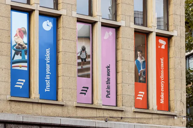
Three tall window banners on a stone building facade carry the Education Elements mark and a short slogan each in blue, pink and orange.
More like this
See all

Summary
Six narrow banners hang in the window bays of a stone building, pairing a cropped student photograph with a flat color panel that carries the brand mark and one short slogan. The same layout repeats in blue, pink and orange.
Visual description
The frame is a three-quarter view of a beige stone facade, shot from below, with banners filling alternating tall window openings. Each pair works the same way: one banner is a full-bleed photograph of a child (on a playground spinner, running up stairs, holding a book), the next is a solid color field. On the color panels a single sentence runs vertically, rotated ninety degrees and set in a heavy condensed sans with a period at the end: "Trust in your vision." on cobalt blue, "Put in the work." on soft pink, "Make every class count." on orange red. A small white or black stepped chevron mark sits at the foot of each color panel, and a simple white pictogram (a flag, three shapes, a lamp) sits at the top. Type is cream on blue and orange, near-black on pink. Autumn foliage and a second building edge sit at the right edge.
Key takeaway
One layout rendered in three colorways reads as a system rather than three separate posters. Rotating the slogan to run the full height turns a narrow, awkward format into the strongest element, and alternating photo panel with color panel gives the facade rhythm without any panel getting crowded.
Reuse notes
A good reference for identity work that has to survive at architectural scale in narrow vertical slots: banners, light-pole flags, window vinyl, exhibition graphics. It depends on a photo library shot loose enough to crop hard, and on a palette with at least three high-chroma members so the repeat does not look monotonous. Note that rotated type is only readable at distance when the line is this short.
More like this
Keep what you find
A free account saves references to boards and can send you a weekly email of picks based on what you save.
To see every result, go Pro.