Preview image. Unlock full-res
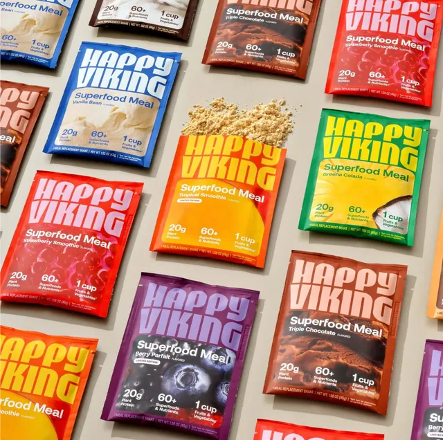
A tilted grid of single-serve shake sachets on a sand backdrop, each flavour a solid colour with a tonal geometric wordmark and a macro food crop.
More like this
See all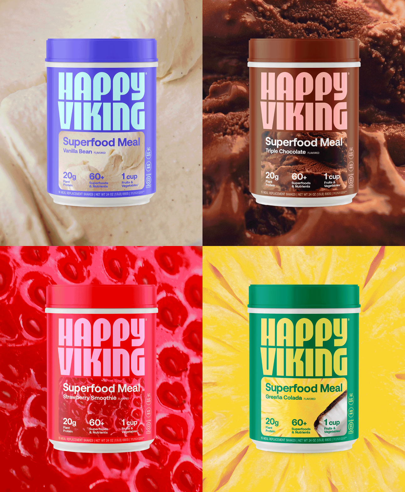

Summary
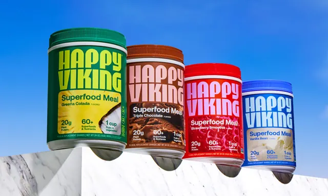
An overhead flat lay of meal-replacement sachets arranged in a slightly rotated grid, using one saturated colour per flavour and a tonal version of the same hue for the wordmark.
Visual description
Roughly fifteen foil sachets lie face up on a warm sand-grey surface, the grid tipped a few degrees off square so rows run diagonally out of frame on every edge. Each pack is a single flat colour: cobalt blue, tomato red, orange, deep brown, emerald green, plum purple and a pale peach. The "HAPPY VIKING" wordmark fills the top third in a heavy geometric sans, tightly stacked over two lines with the letters cut by thin horizontal seams, and is always printed in a lighter or brighter tone of the pack colour rather than in white. A registered mark sits tight to the final letter. Below the wordmark, "Superfood Meal" is set in a plain white sans with the flavour name beneath in lighter weight and the word "FLAVORED" reduced to caption size. The lower half of each pack carries a tightly cropped macro photograph of the flavour, whipped vanilla, chocolate ice cream, glossy strawberries, blueberries, pineapple and coconut, running edge to edge behind three evenly spaced stat blocks: "20g Plant Protein", "60+ Superfoods & Nutrients", "1 cup Fruits & Vegetables". A footer rule holds "1 MEAL REPLACEMENT SHAKE" and the net weight. Two packs add a small white "LIMITED EDITION" pill. A loose heap of beige powder is spilled into an empty cell near the centre, the only element breaking the grid.
Key takeaway
Colouring the wordmark in a tone of the pack colour instead of white gives the range a soft, self-coloured look while keeping the type enormous, and the repeated three-stat strip means every flavour reads as the same product at a glance. Leaving one grid cell empty for spilled powder turns a flat pack shot into a product story without adding props.
Reuse notes
Reach for this when a range shot has to sell both variety and consistency, for example a supplement, coffee or snack line with many SKUs. The rotated grid makes it crop well to square and vertical social formats. The tonal wordmark needs enough value separation from the pack colour to survive small sizes, so it is weakest on the palest packs.