Preview image. Unlock full-res
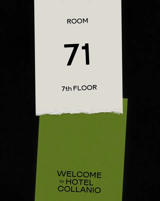
Hotel wayfinding signage with a cream upper panel and bold olive-green lower block, using oversized numerals and clean hierarchy to identify room location.
Summary
Hotel room-number signage balancing a neutral cream upper section with a bold olive-green lower block, using large numerals and clean sans-serif to create quick visual hierarchy for guests locating their room.
Visual description
A vertical rectangular composition split between two distinct color zones: cream above, olive-green below. The top half holds three right-aligned text blocks in simple sans-serif ("ROOM", a dominant black "71", and "7th FLOOR"), each progressively emphasizing the room number. A subtle diagonal texture divides the two color fields. The lower half displays "WELCOME to HOTEL COLLANIO" in dark sans-serif, centered and stacked. The palette is restrained: off-white, pure black, and a single accent in muted olive-green.
Key takeaway
The hierarchical stacking of room metadata (ROOM label, bold numeral, floor identifier) that scans in seconds. The strength of the two-color field division with a textured edge, signaling both wayfinding clarity and deliberate craft. The elegant proportions between the cream and green zones create balance without symmetry.
Reuse notes
Strong model for any hospitality or commercial wayfinding system where guests must quickly identify locations. The cream and olive pairing reads as refined and calm. Works best when the two color zones are roughly balanced (not 50/50, but close) and the numeral is given generous space to dominate.
More like this




Keep what you find
A free account saves references to boards and can send you a weekly email of picks based on what you save.
To see every result, go Pro.