Preview image. Unlock full-res
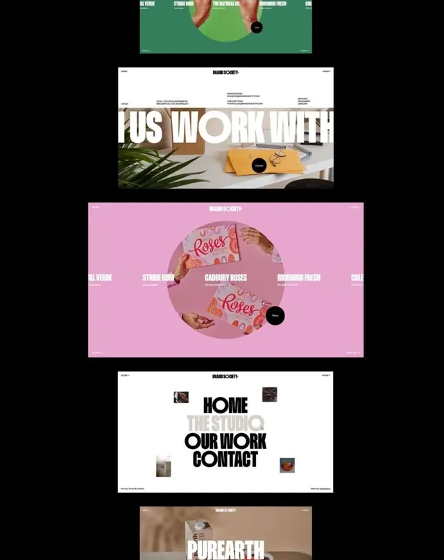
Portfolio website grid of consumer product brands, each section color-blocked and organized with product photography, typography, and rounded-rectangle framing.
Summary
A portfolio website showcasing multiple consumer product brands organized in color-blocked horizontal sections, each combining product photography, bold typography, and rounded-rectangle cards with structured information hierarchy.
Visual description
Vertical stack of distinct brand showcases for Brand Society. Top section (green): horizontal scrolling client logos (Al Verde, Stride Gum, The Natural Co., Morning Fresh). Middle section (off-white): large bold sans-serif headline "US WORK WITH" layered over product photography and plant styling. Pink section: brand name "Brand Society" in white header, circular layout featuring packaged "Roses" products photographed at angles, surrounded by client logo labels. White section: heavy black typography ("HOME", "THE STUDIO", "OUR WORK", "CONTACT") positioned asymmetrically with scattered product photography (food, textiles, objects). Tan/beige section (partial): continuing the pattern. Each section uses abundant white space and clearly delineated rounded corners.
Key takeaway
The power of consistent color-blocking combined with product photography to create visual rhythm across a portfolio. Asymmetric typography placement within white space feels dynamic without clutter. The circular product showcase on pink background demonstrates how photograph arrangement alone can create composition without additional graphical elements.
Reuse notes
Use for agency or creative services portfolios featuring multiple consumer brands. The split-section approach works well when each client deserves visual distinction. Effective when product photography is high-quality; requires careful spacing to avoid cramping. Pairs well with organized sans-serif type and muted earth-tone palettes.
More like this




Keep what you find
A free account saves references to boards and can send you a weekly email of picks based on what you save.
To see every result, go Pro.