Preview image. Unlock full-res
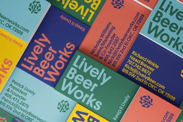
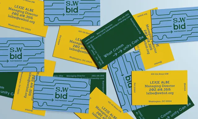
Overhead flat lay of SWBID business cards in blue, yellow, and dark green, showing a wordmark built from a rounded routed line and an arrow.
More like this
See all
Summary
A scattered overhead of business cards in three colorways, all built from the same rounded meandering line that carries the wordmark and ends in an arrow.
Visual description
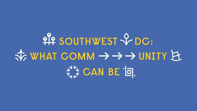
Roughly twenty landscape cards lie overlapping at loose angles on a pale grey-blue surface, shot straight down. Three stocks repeat: cornflower blue with dark green printing, mustard yellow with blue printing, and dark green with pale blue printing. The face of each blue card carries the wordmark "S.W bid" set large with "PARTNERSHIP" tracked out beneath, sitting inside a set of rounded horizontal lines that bend around the letterforms like routed channels, with a short arrow head terminating the line at the left. The yellow reverse holds contact details in a geometric sans with slightly flared numerals: a name, "Managing Director," a phone number, an email, "swbid.org," a street address, and "Washington, DC 20024," ranged centrally with generous leading. Dark green cards carry the line "What Comm to unity Can Be" split by two arrow glyphs across the middle, with contact details set small and rotated around the edges. The cards show a visible uncoated fiber texture and thin drop shadows where they stack.
Key takeaway
The rounded routed line doubles as a container for the wordmark and as a pattern across the card back, so one drawn element carries the whole identity. Rotating the type around the card edges turns a scatter shot into a composition that stays legible from any angle.
Reuse notes
Good reference for a place or partnership identity that needs to feel civic but warm, with a small print budget: three flat stocks and one ink each. The bent line motif requires the wordmark to keep a fixed width or the channels stop aligning. The split-headline card only makes sense as part of a set, so do not use it as the sole leave-behind.