Preview image. Unlock full-res
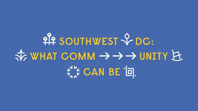
Blue statement frame where line-art icons and arrows are set inline with the headline as if they were letters.
More like this
See all

Summary
A three-line centered headline on solid blue in which white line-art icons are dropped into the sentence as substitute characters.
Visual description
A flat medium blue field holds three centered lines of condensed all-caps yellow type reading SOUTHWEST DC: WHAT COMM UNITY CAN BE. Between the words sit white outline icons at cap height: a pair of street lamps, a small flowering plant, a fan or fountain shape, a rocking chair, a sunburst circle, and a square spiral that stands in for the final period. Three white right-pointing arrows fill the gap in the middle line, splitting COMM from UNITY so the arrows visibly do the work of joining the word. All icons share one uniform stroke weight matched to the type, and the composition is vertically centered with generous empty blue above and below.
Key takeaway
Matching icon stroke weight to the type's stem weight lets pictograms sit inline as characters instead of decoration. Breaking a key word apart and rebuilding it with arrows makes the brand idea legible in a single glance.
Reuse notes
Reach for this when an identity has a pictogram set that needs to feel native to the writing, not bolted on. Requires a headline short enough to survive being interrupted, and a controlled palette so the icons stay a quiet second color.