Preview image. Unlock full-res
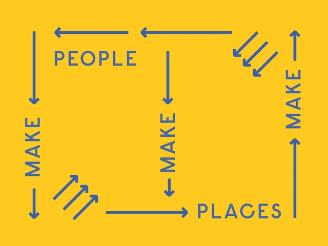
Yellow brand graphic in which the words PEOPLE, MAKE and PLACES are wired into a closed loop by blue arrows.
More like this
See all
Summary
A two-color brand statement graphic where three words and a set of blue arrows form a never-ending loop across a flat yellow field.
Visual description
Flat saturated yellow fills the whole frame. In medium blue, four words sit at the edges of a large implied rectangle: PEOPLE near the top left, PLACES at the bottom right, and MAKE twice on the left and center running bottom-to-top, plus a fourth MAKE on the right side running bottom-to-top. Straight arrows with heavy chevron heads connect them, two pointing left along the top, one pointing right along the bottom, and vertical arrows running down the left and center and up the right. Two clusters of three short diagonal arrows sit in the top right and bottom left corners, stepping the eye around the turn. The type is a condensed all-caps geometric sans with wide letterspacing, and every element is the same line weight as the arrows, so the words read as part of the diagram rather than as a caption on top of it.
Key takeaway
Setting the type at the same stroke weight and color as the connectors turns a slogan into a machine. Rotating the repeated word MAKE to sit vertically on each side lets one short phrase run in a continuous circuit with no repetition fatigue.
Reuse notes
Good reference for a civic, community or placemaking identity that needs to state a philosophy without an illustration. Works when you have a short cyclical phrase; a longer line would break the loop geometry. Depends on a strong two-color pairing and a lot of empty field to breathe.