Preview image. Unlock full-res
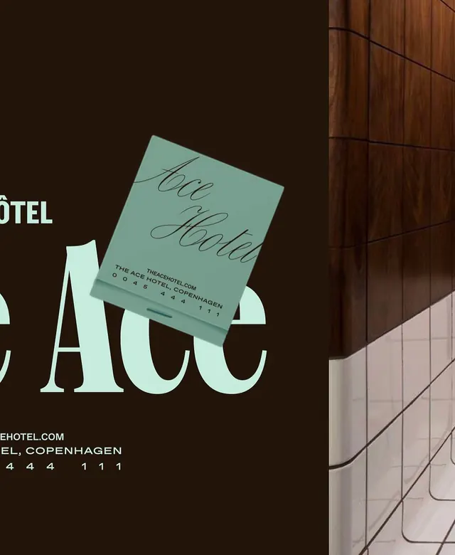
ACE Hotel collateral showing tilted mint-green invitation card with hand-script typography against dark brown field, flanked by cream-white display type and natural wood cladding.
Summary
ACE Hotel collateral showing tilted mint-green invitation card with hand-script typography against dark brown field, flanked by cream-white display type and natural wood cladding.
Visual description
A dark chocolate-brown background occupies the left three-fifths. Overlaying it is a large, rotated mint-green card (invitation or business card) in sharp perspective, tilted roughly 30 degrees clockwise. The card bears "ACE" in a loose, flowing script (light pencil or ink) and contact details in tight sans-serif below (theacehotel.com, Copenhagen address, phone digits). Cream-colored sans-serif capitals spell "ACE" in a heavy, geometric serif or grotesque face at bottom-left. The right two-fifths shows warm golden-brown wooden wall panels (vertical grain), with a geometric tile pattern or window grid in pale cream visible at the very edge, suggesting an interior environment. The combined effect is a staged, architectural brand presentation.
Key takeaway
Tilting a primary element (the card) creates visual tension and implies sophistication without feeling chaotic. Using script on the card and sans-serif for the display word creates tonal contrast. The split field (dark brown, wood texture) grounds the composition while the mint-green card pops as a hero element. Natural material textures (wood) elevate the overall feel from corporate to craft-driven.
Reuse notes
Ideal for hospitality, design-forward retail, or event venues. The tilted card mockup works for stationery, invitations, or brand guidelines showing application. The Scandinavian restraint (muted mint, dark earth tones, natural wood) appeals to contemporary luxury. Requires high-quality photography or 3D rendering to maintain the premium feel.
More like this



Keep what you find
A free account saves references to boards and can send you a weekly email of picks based on what you save.
To see every result, go Pro.