Preview image. Unlock full-res
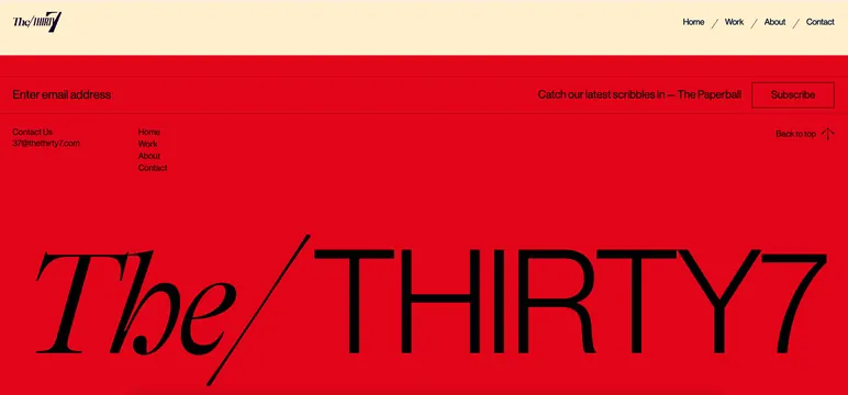
A portfolio footer page for The Thirty Seven studio, anchored by a large-scale logotype on a bold red field with minimal navigation and footer details.
Summary
A portfolio footer page for The Thirty Seven studio, dominated by a large logotype in cream-colored display italic against a bold red field.
Visual description
The page is divided into two halves. The top strip (pale cream background) contains a small italic wordmark "the/thirty7" in the upper left, navigation links (Home, Work, About, Contact) in a serif/sans-serif mix in the upper right. The main section is a bold red field occupying two-thirds of the visible area, filled with the large logotype "The / THIRTY7" set in two lines. The italic portion "The /" is graceful and condensed; "THIRTY7" is bold sans-serif capitals. At the bottom, a cream band contains left-aligned footer text (Contact Us, email, navigation links) and right-aligned "Back to top" copy with an arrow. A newsletter signup prompt ("Catch our latest scribbles in The Paperball") is centered with a bordered Subscribe button. The spacing is generous, the color is pure vibrant red, and the typography uses strong contrast and clear hierarchy.
Key takeaway
The fearlessness of a single dominant color filling most of the viewport. The scale of the logotype (it consumes the entire red field) creates instant brand presence. The technique of using negative space and type contrast (italic paired with capitals, serif with sans) keeps the mark lively despite its simplicity. The three-tier footer (newsletter, navigation, contact) is well-organized and scannable.
Reuse notes
Excellent reference for portfolio landings, studio homepages, and branded microsites that need bold, confident presence. Works best for creative and agency verticals where an intense color statement won't feel out of place. The red field technique demands strong logo design to avoid overwhelming it, so this approach is not universal. The newsletter signup placement and wording are worth adapting for email-capture contexts.
More like this




Keep what you find
A free account saves references to boards and can send you a weekly email of picks based on what you save.
To see every result, go Pro.