Preview image. Unlock full-res
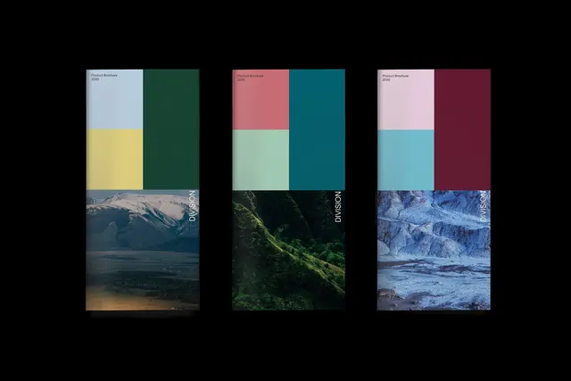
A brand system presented across three columns, each pairing a coordinated color palette with type samples and dramatic landscape photography.
Summary
A brand system presented across three columns, each pairing a coordinated color palette with type samples and dramatic landscape photography.
Visual description
Three identical columns showcase distinct brand variations. Each column is divided into thirds: a top section with four color swatches (pale neutral, muted mid-tone, and two deeper hues), a middle section with type specimen labeled "Product Brochure 2020", and a bottom full-bleed landscape photograph. Left column: pale blue, yellow, and dark green paired with snowy mountain landscape. Middle: coral-pink, pale mint, dark teal with dense forested slope. Right: lavender-pink, powder blue, deep burgundy with rocky blue-tinted coastline.
Key takeaway
Pairing coordinated color palettes with contextual photography is a powerful way to communicate a brand's personality and intended tone. The three-variation approach shows how a single typographic system can adapt across different colorways. The full-bleed imagery creates visual weight and makes each version feel distinct despite the consistent structure.
Reuse notes
Effective for product branding, editorial design systems, or corporate guidelines that need to show versatility. The landscape photography grounds each palette in a specific mood or context, making abstract colors feel concrete. Scale this approach to any number of variations; three is effective but not required. Works best for brands that can source distinctive, on-brand photography.
More like this



Keep what you find
A free account saves references to boards and can send you a weekly email of picks based on what you save.
To see every result, go Pro.