Preview image. Unlock full-res
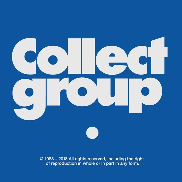
Bold geometric wordmark for Collect Group, set in chunky sans-serif letters on cobalt blue background, anchored by a circular accent mark below.
Summary
Bold geometric wordmark for Collect Group, set in chunky sans-serif letters on cobalt blue background, anchored by a circular accent mark below.
Visual description
Centered stacked two-line wordmark: "collect" and "group" in large, geometric sans-serif letters with uniform stroke weight and rounded terminals, rendered in off-white against a solid cobalt blue ground. Text occupies most of the vertical space, with consistent letter spacing and generous line-height. Below the wordmark sits a single circular element in matching off-white, positioned centrally as a visual anchor or period mark. Typography maintains even weight distribution across all letters, creating a cohesive, structured appearance. Small copyright text (1983-2018 All rights reserved...) sits centered at the bottom in reduced scale, providing legal attribution without breaking the mark's authority.
Key takeaway
The chunky, geometric letterforms with rounded terminals feel contemporary and welcoming while remaining authoritative. The stacked layout creates vertical emphasis and clarity. The singular circular accent below acts as a typographic period, grounding the mark without adding visual clutter. The cool blue background against off-white creates maximum contrast and memorability.
Reuse notes
Ideal for creative agencies, design studios, or B2B service firms wanting a modern, confident identity. The bold geometric approach reads well at any scale and maintains clarity in single-color applications. Works effectively on both light and dark contexts due to the high-contrast color strategy. Best paired with a tight, minimal supporting system to avoid competing with the mark's strength.
More like this


Keep what you find
A free account saves references to boards and can send you a weekly email of picks based on what you save.
To see every result, go Pro.