Preview image. Unlock full-res
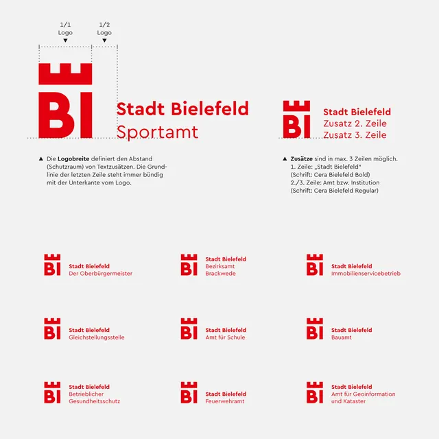
German municipal branding system using a castellation-pattern logo in red and white, shown applied across multiple office departments in a modular grid format.
Summary
A municipal branding system for Stadt Bielefeld (Bielefeld City government) featuring a distinctive red square mark with a castellation pattern, applied across multiple departments in a modular grid showing size and proportion variations.
Visual description
The top half shows the primary mark (a red square with battlements/flag-like pattern) paired with department names in sans-serif: "Stadt Bielefeld Sporfamt" (Sports Office) and "Stadt Bielefeld Ordnungsamt" (Municipal Order Office), with metadata text in smaller type. Below, a grid of nine mark variations shows the logo applied at different scales and proportions, each paired with department labels. The palette is strictly limited to red (#E3000B), white, and black, creating visual authority through constraint. The grid structure emphasizes the system's flexibility and institutional rigor.
Key takeaway
The castellation motif itself, which reads both as a fortification/official seal and as an distinctive, repeatable abstract mark. The grid layout as a way to document system flexibility without creating overcomplicated guidelines. The scale variations that show how the mark maintains legibility across applications while staying visually consistent.
Reuse notes
Strong model for government, municipal, or institutional branding where the mark needs to be applied at wildly different sizes (signage, letterhead, digital). The red-and-white severity works well for public services or authority-bearing organizations. The castellation pattern is distinctive enough to be instantly recognizable but abstract enough to work across contexts.
More like this







Keep what you find
A free account saves references to boards and can send you a weekly email of picks based on what you save.
To see every result, go Pro.