Preview image. Unlock full-res
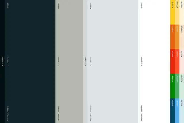
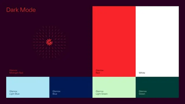
A dark-mode UI palette specimen showing six named colors: a bold red, pure white, light blue, dark blue, light green, and teal, arranged as labeled swatches on a deep purple-black background.
Summary
A cohesive dark-mode color system demonstrating a primary accent (bright red), supporting teals and blues, with white and a deep purple-black foundation, labeled and arranged as a structured swatch palette.
Visual description
Deep purple-black background with a centered "Dark Mode" label in red text. A large vertical split shows two color blocks: a vibrant red (bright primary) on the left, pure white on the right, with "Glamour" and "Red" / "White" labels. Below, a grid of four horizontal swatches: light cyan (Glamour Light Blue), dark navy (Glamour Blue), pale yellow-green (Glamour Light Green), and deep teal (Glamour Green), each with lowercase type labels. All swatches have consistent proportions and even spacing. The typography is minimal sans-serif, white or black text placed for maximum contrast against each swatch. The palette reads as intentional and balanced, with the red as the dominant accent, cool colors as secondaries.
Key takeaway
The pairing of a single high-saturation accent (red) with cool complementary colors creates visual balance and UI hierarchy. Naming colors (Glamour Light Blue, Glamour Green) builds brand vocabulary. Displaying both the full swatches and a labeled grid allows designers to both see the impact and reference specific values.
Reuse notes
Strong model for SaaS and app branding color systems. The dark background and high-contrast accent work well for modern digital products. The cool-dominant secondary palette keeps the overall feel calm despite the bold red. Use this structure for UI/UX design system documentation.