Preview image. Unlock full-res
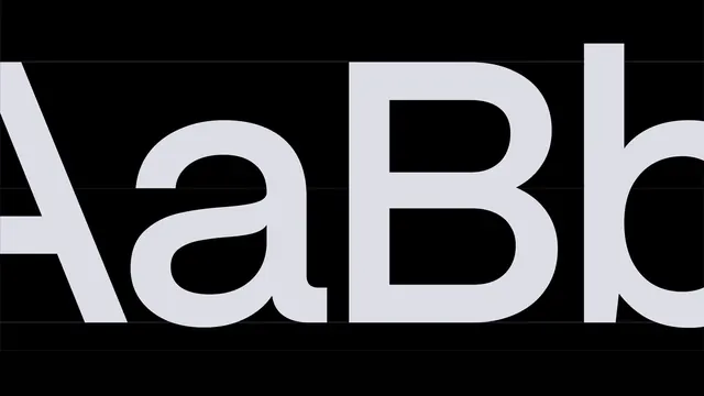
Extreme close crop of the brand typeface set as AaBb in pale lavender on black, with hairline baseline and x-height guides running through.
More like this
See all

Summary
A typeface shown at a crop so tight that the letters run off both edges, turning a specimen into a study of curve and joint.
Visual description
Against a near-black ground, four characters set in a pale lavender-white neo-grotesque fill the frame: the right diagonal and crossbar of a capital A, a double-storey lowercase a, a capital B, and the start of a lowercase b whose bowl is cut by the right edge. The type is so large that stroke modulation is visible, with the a's bowl thinning where it meets the stem and the B's two bowls joining the stem with a short flat spine. Hairline horizontal rules cross the full width at cap height, x-height, and baseline, plus a fainter one below for the descender line, drawn thin enough to read as measurement rather than decoration. Letter spacing is tight, close to touching between the a and the B. No labels, weight names, or supporting copy appear.
Key takeaway
Cropping a specimen past the edges forces attention onto the joints and counters instead of the alphabet. The faint metric lines add the engineering note without the clutter of a labelled diagram.
Reuse notes
Ideal as a typography spread in a brand guideline or a scroll section on a brand site, especially just before the full character set. It only works with a typeface whose curves reward the magnification, and the guide rules need to be barely visible; any heavier and the frame turns into a technical drawing. Reserve the labelled version for the page that follows.
More like this





Keep what you find
A free account saves references to boards and can send you a weekly email of picks based on what you save.
To see every result, go Pro.