Preview image. Unlock full-res
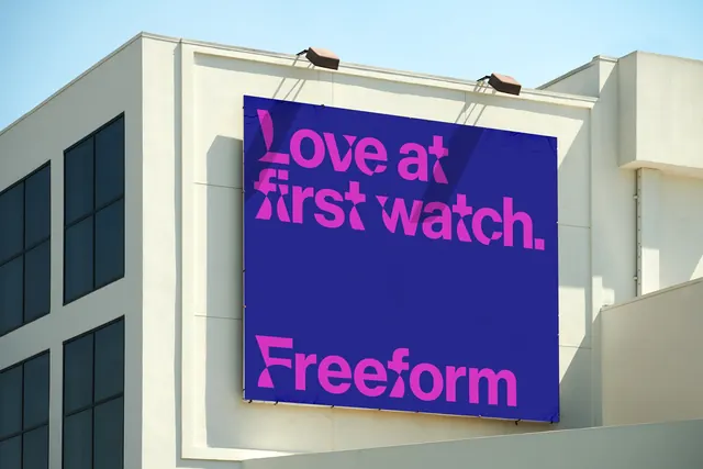
Rooftop billboard photographed against blue sky, carrying a magenta tagline and the Freeform wordmark on a deep indigo ground.
More like this
See all
Summary
The identity shown at outdoor scale: a two-colour billboard where the tagline and the wordmark share one heavy custom sans built from sliced, wedge-cut letterforms.
Visual description
A large fabric banner is stretched on a frame mounted to the corner of a low cream-coloured building, shot from below against a clear pale blue sky, with two angled floodlights on the parapet above and a diagonal shadow falling across the left half of the panel. The banner ground is a deep indigo blue. Across the upper portion, set left and running two lines, is the line "Love at first watch." in hot magenta. The lower portion carries the "Freeform" wordmark in the same magenta at roughly double the weight presence. Both are set in a chunky low-contrast display sans whose letters are cut with angled slices: the L has a wedge notch, the f and r terminals are sheared, the o and e counters are compressed to narrow slots. Type is flush left in both blocks with a large empty gap between them. The building's grid of dark windows fills the left third of the photo.
Key takeaway
Using the same cut-letterform typeface for both the message and the wordmark means the tagline is already brand, so a two-colour panel with no imagery still reads as unmistakably owned. The gap between tagline and logo lets the mark land as a signature rather than a caption.
Reuse notes
Reference this for out-of-home application in a brand case study, or when arguing that a distinctive typeface can replace a graphic device entirely. The magenta-on-indigo pairing is high energy but low luminance contrast, so it wants large sizes and daylight; it would struggle at small scale or in print on uncoated stock. Shot on location like this, the shadow across the panel is honest but does eat some of the tagline's punch.