Preview image. Unlock full-res
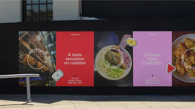
A street hoarding papered with alternating food photography and flat color posters, unified by a circular ROTORIOUS lockup and sticker-style badges.
More like this
See all
Summary
A black construction hoarding on a sunlit street carrying a run of portrait posters that alternate between close-up food photography and flat color type panels, all tied together by a circular wordmark that wraps around each image.
Visual description
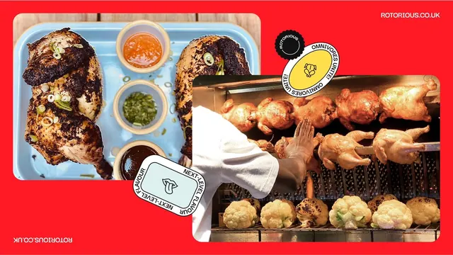
Five poster panels sit edge to edge in a band across the hoarding, cropped at both ends. Panel one is a photograph of whole chickens on a rotisserie spit inside a steel oven, with ROTORIOUS set in white caps around the left half of a thin white circle. Panel two is flat red: a small lowercase "rotorious" wordmark at the top, then "A taste sensation on rotation" in three centered lines of white sans, and at the bottom a pin icon above "Unit 10 / Market Stalls / 133a Rye Lane". Panel three is a dark photograph of a spiced chicken breast over rice with scallions and slaw, the circular ROTORIOUS lockup wrapping its right side. Panel four repeats the red panel's structure in lilac with "Chicken. Beer. Cocktails." Panel five is another chicken close-up, partly cropped by the frame. Sticker-like badges overlap the seams: a white circle reading NEXT-LEVEL FLAVOUR, a yellow circle reading OMNIVORES UNITE! around a small icon, and a rounded red triangle reading BRITISH BBQ with a raised-hand mark. A metal handrail and paving slabs occupy the foreground, with hard shadow falling across the right of the wall.
Key takeaway
A circular wordmark that orbits the subject solves the hardest problem in food branding: it locks the logo to any photograph regardless of crop, without a box or a scrim. Alternating photo and flat-color panels gives the run rhythm and lets the address repeat without feeling like an ad every time.
Reuse notes
Reach for this when a small food business needs a lot of street frontage from a handful of assets. The badge stickers do a lot of tonal work and would be easy to overuse, and the flat panels depend on the color pair being unusual enough to avoid generic fast-food red. The circular lockup needs a name long enough to close a decent arc.