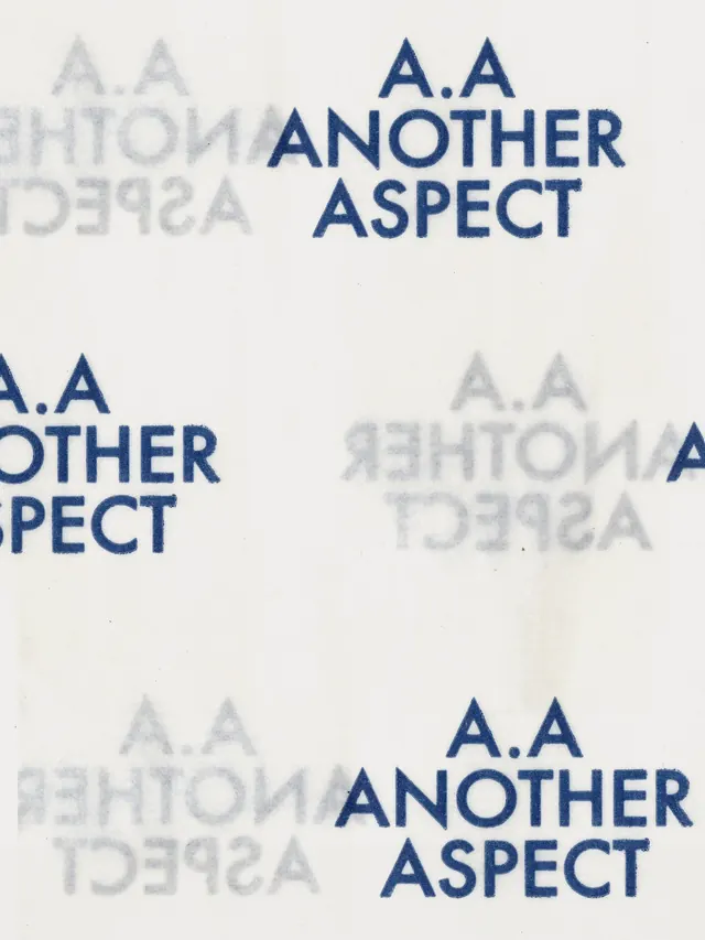
Preview image. Unlock full-res
A brand identity update for sustainable fashion company Another Aspect, featuring refined typography, textured layouts, and minimalist branding materials.

Summary
A refined brand identity system for sustainable fashion manufacturer Another Aspect, featuring a minimalist navy logotype system, subtle typographic variations, and textured product presentation materials.
Visual description
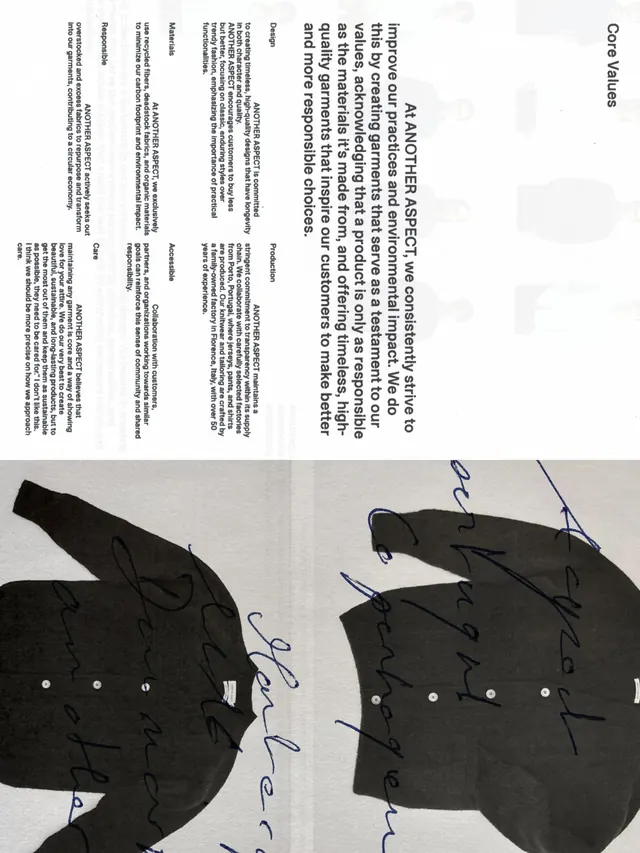
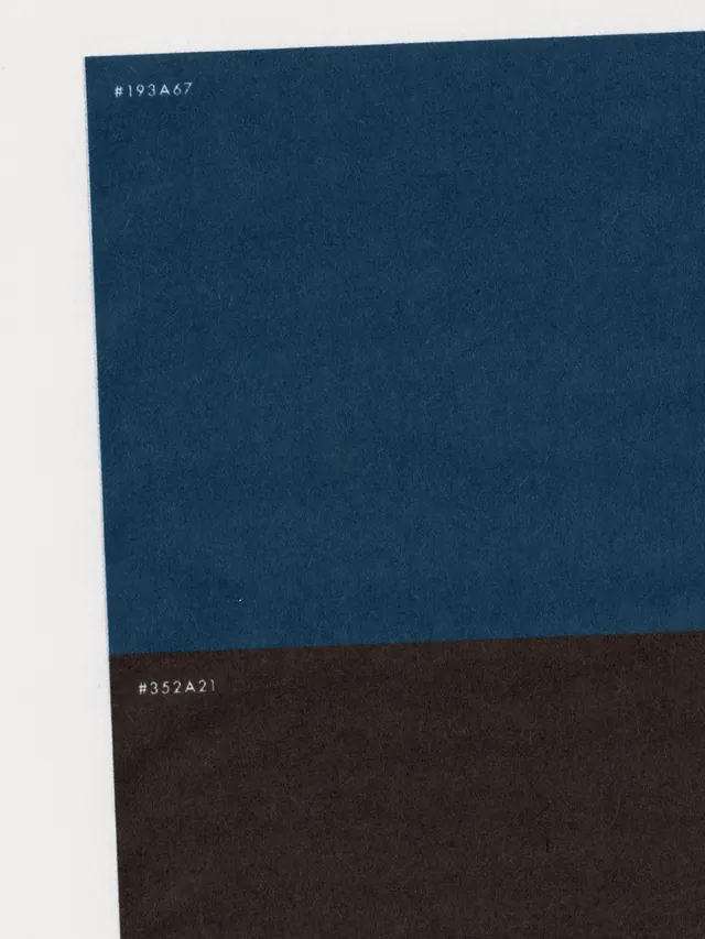
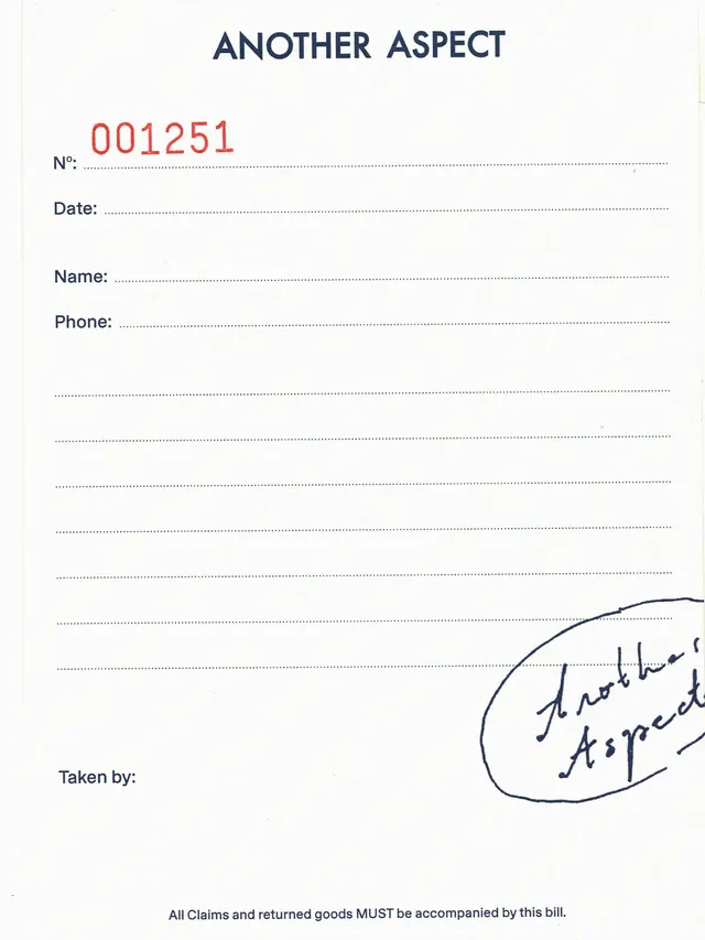
The carousel opens with a layout showing the refined Another Aspect logo (A.A ANOTHER ASPECT) in navy blue on off-white, overlaid with ghost/faded versions of the wordmark at different scales and opacities. The second slide shows the brand's printed materials and guidelines in a similar navy and cream palette. The third and fourth slides show product photography of textile items (wool blankets, carpets) and collateral materials (invoices, labels). The overall aesthetic is restrained and refined: navy blue on off-white/cream, minimal contrast, typography-driven, with subtle use of grayscale layering and opacity variations. The branding conveys quality, sustainability, and craft without unnecessary ornamentation.
Key takeaway
Subtle typographic layering using opacity and scale to create depth without adding new colors or elements. The ghost/watermark treatment of the logotype creates visual interest while maintaining minimalism. Appropriate scale hierarchy between hero branding and supporting materials.
Reuse notes
Strong reference for premium sustainable/ethical fashion brands, luxury goods, and B2B product manufacturers. The restrained palette and typographic focus communicate quality and intentionality. Works particularly well for brands emphasizing craftsmanship, responsibility, and timelessness over trend. The opacity-layering technique is reusable for many contexts.
From this post: Another Aspect brand identity refresh
View post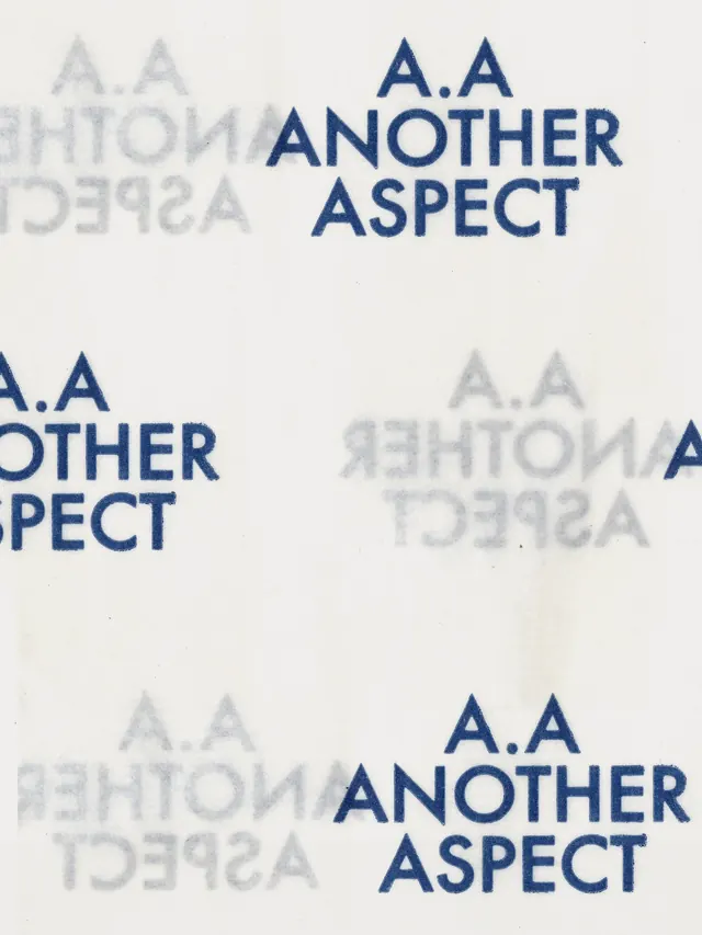
More like this

Keep what you find
A free account saves references to boards and can send you a weekly email of picks based on what you save.
To see every result, go Pro.