Preview image. Unlock full-res
Identity system for Roebling, an AI platform for process engineering, built from a single dot that scales across logo, product UI, and collateral.

Summary
A unified branding system for Roebling, a B2B process engineering platform, where a single geometric dot becomes the foundational element across all brand applications, from the wordmark through the product dashboard interface and printed collateral.
Visual description
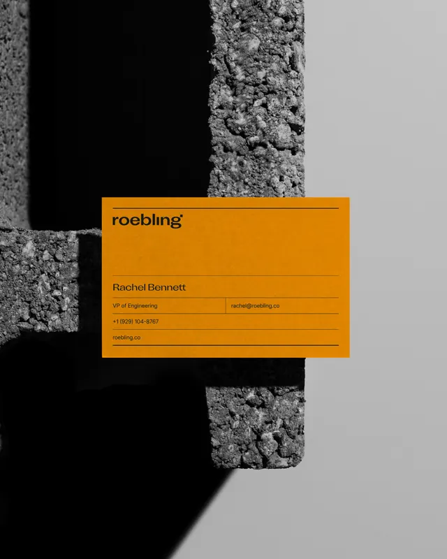
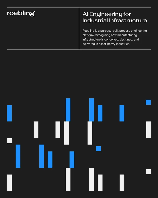
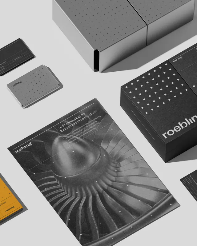
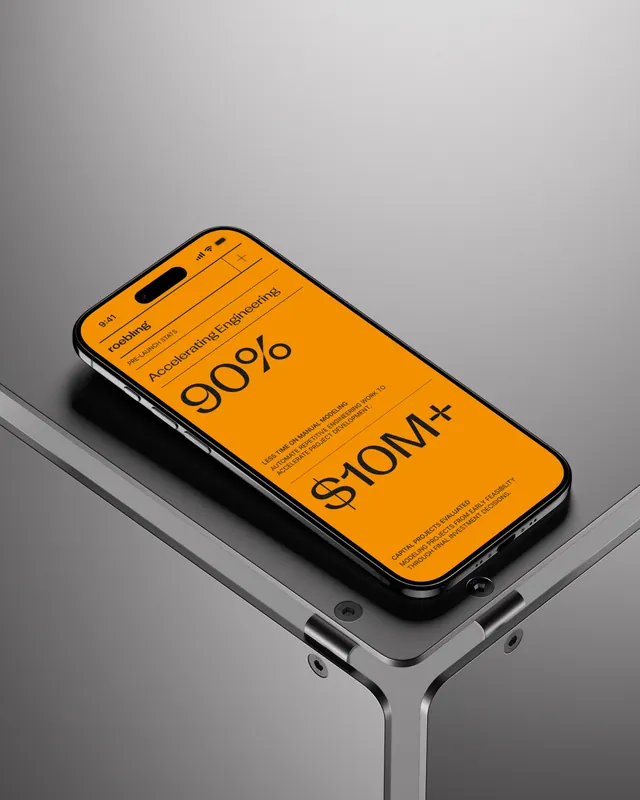
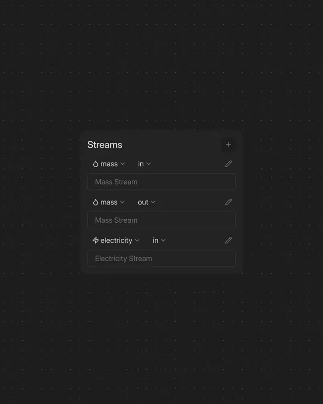
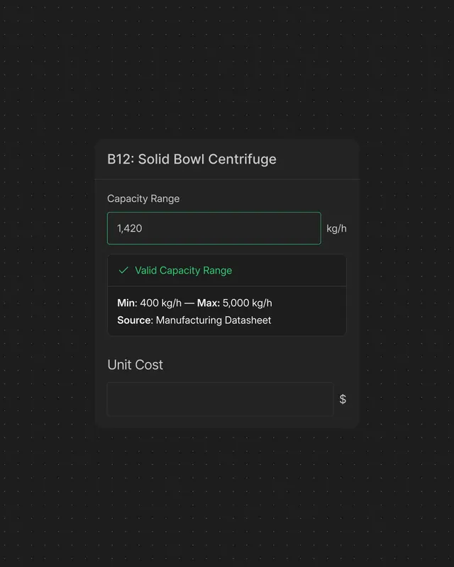
The identity centers on a small dot that transforms across contexts. The cover slide shows bold, oversized "roebling" type in black sans-serif on a bright blue background, with evenly spaced black dots creating a grid pattern above and below the wordmark. Subsequent slides reveal how the system scales: typographic documentation pages use white text on dark backgrounds with structured layouts; product UI mockups display the dot expanded into a node-based grid forming connection points in a dashboard interface; collateral includes business cards and printed materials using the dot at varying scales and contexts. The overall palette stays disciplined with blue, black, white, and grays. The video poster suggests motion design is part of the presentation.
Key takeaway
Building a scalable identity from a single primitive mark that functions at any scale, from micro (dot) to macro (grid system), and translates seamlessly from logo to product interface. The constraint of one geometric element forces cohesion across brand touchpoints.
Reuse notes
Strong model for technology and infrastructure brands where internal systems mirror brand systems. Works especially well for platforms targeting engineers and technical buyers who appreciate systematic, modular thinking. Requires consistent application across product and marketing surfaces to maintain coherence.