Preview image. Unlock full-res
A fifteen-slide brand identity carousel for Granola, an AI-powered notepad for meetings, built on a vibrant lime-green field with dark typography and applications spanning merchandise, UI, print, and environmental design.

Summary
A fifteen-slide identity system for Granola, an AI meeting notepad, anchored on an energetic lime-green color that dominates applications from app UI and packaging to office signage, paired with sharp dark typography and a human-centered design philosophy that rejects sterile AI aesthetics.
Visual description
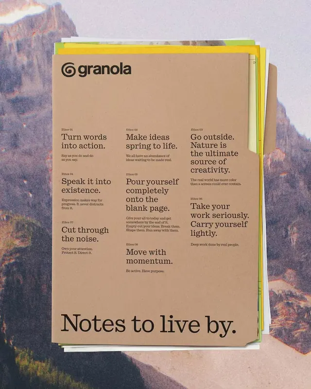
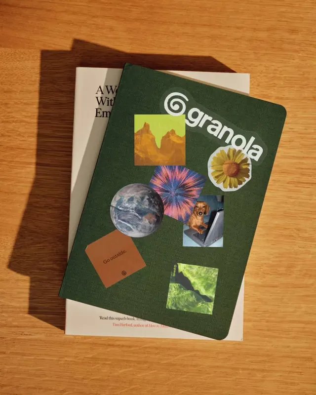
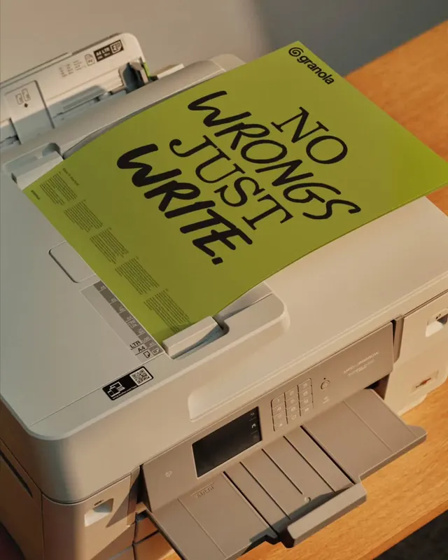
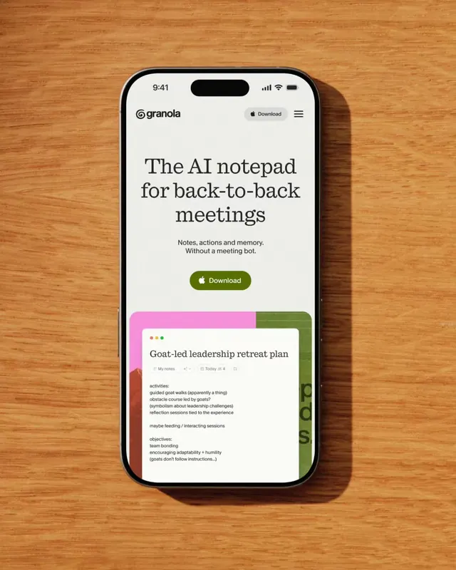
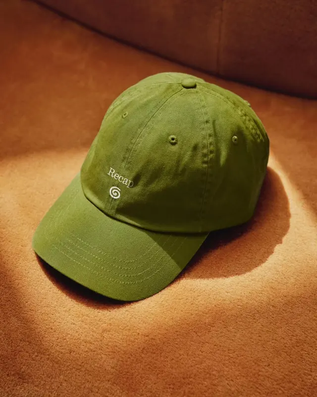
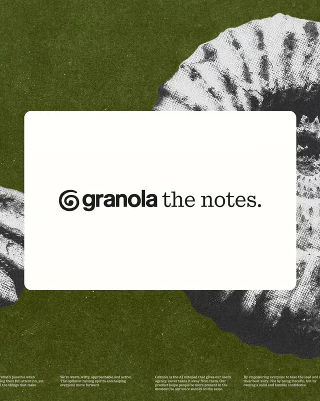
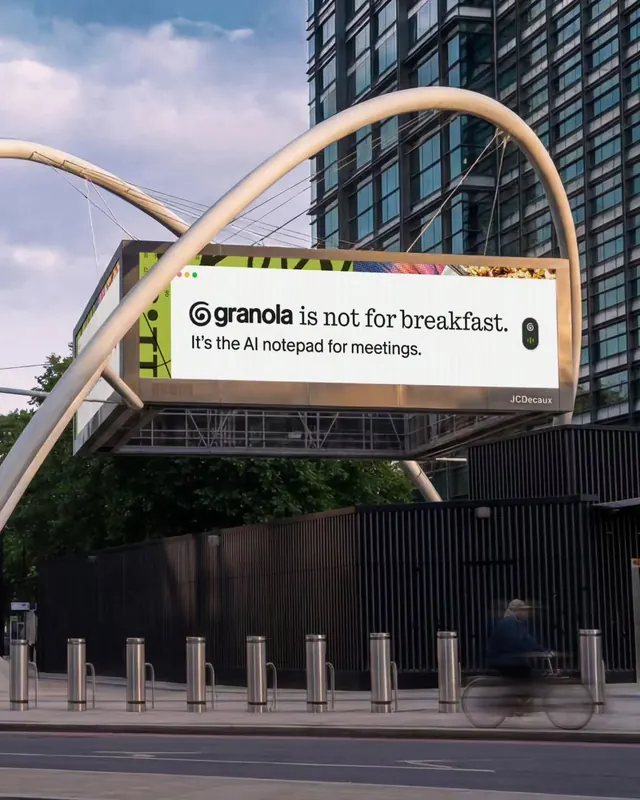
The carousel opens with the Granola logotype, a dark sans-serif wordmark on the signature bright lime-green background. Subsequent slides showcase the identity across diverse applications: app interfaces with the green field as primary background, merchandise including packaging and branded materials, office photography showing the green applied to environmental signage and desk spaces, merchandise like notebooks and merchandise with the Granola mark, and brand-building guidelines. Typography pairs a clean sans-serif headline font with generous whitespace. Layouts are minimal and centered, allowing the lime-green color to dominate visual attention. Dark text on green creates strong contrast. Photography includes warm, human-centric imagery showing real work environments and product use. The tagline "Granola is not for breakfast. It's the AI notepad for meetings" appears in later slides.
Key takeaway
Rejecting sterile, muted AI aesthetics in favor of warm, energetic color makes an AI product feel human-centric and approachable. The single dominant hue, repeated without variation, becomes instantly recognizable. Generous white space and centered compositions avoid visual noise, emphasizing simplicity and clarity.
Reuse notes
Strong for productivity and AI-SaaS brands targeting knowledge workers who want personality without compromising professionalism. The bright, single-color approach demands confidence but pays off in brand recognition and social media presence. Works across merchandise, digital, and environmental applications. The warm, human-centric tone contrasts effectively with competitor austerity.