Preview image. Unlock full-res
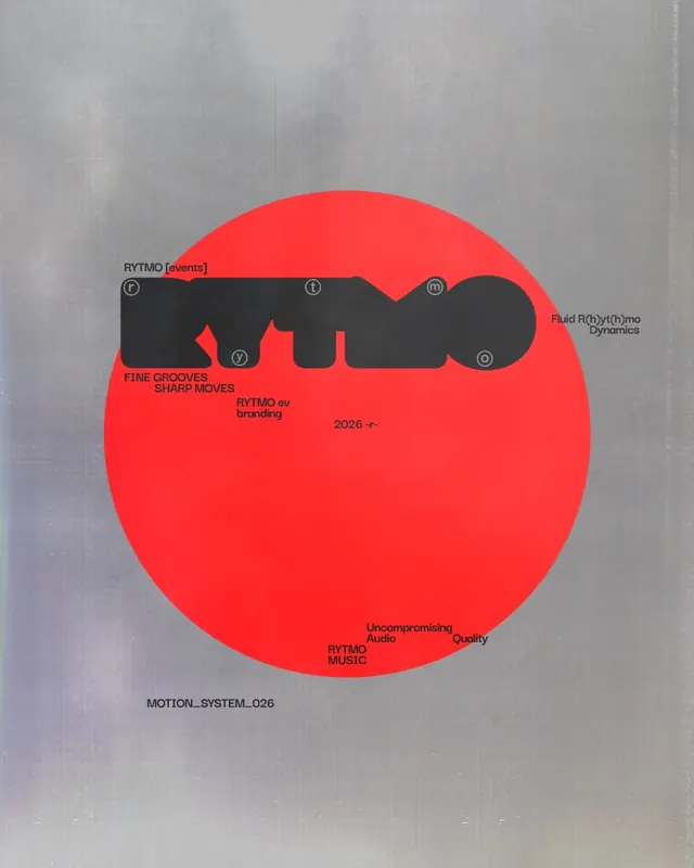
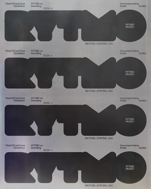
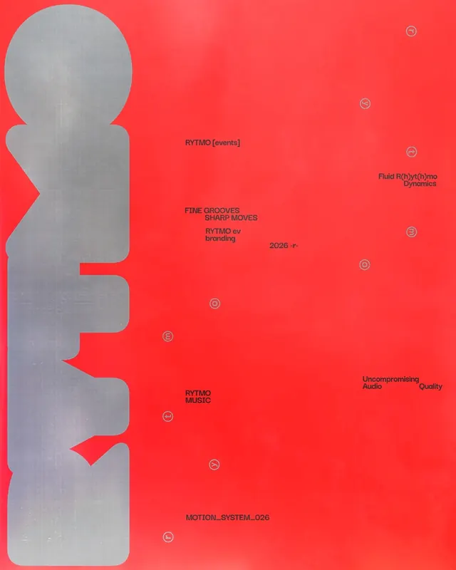
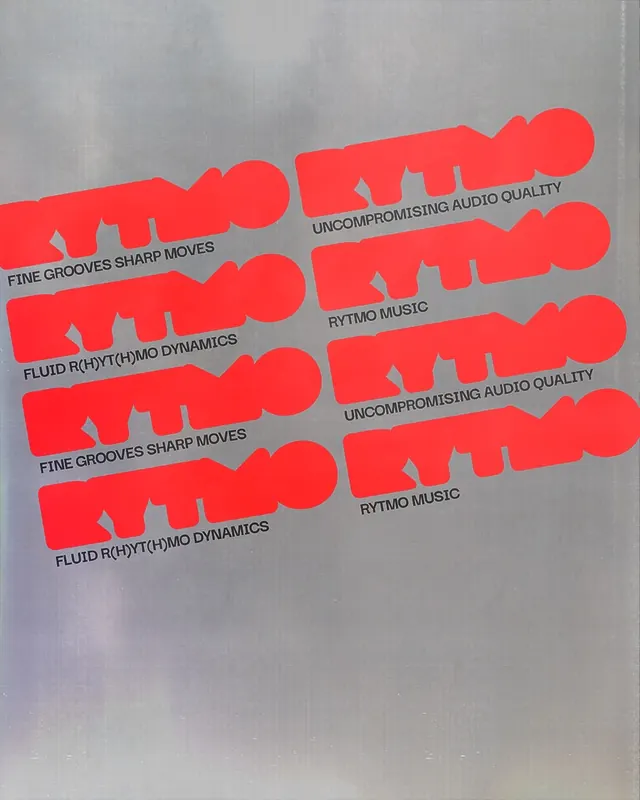
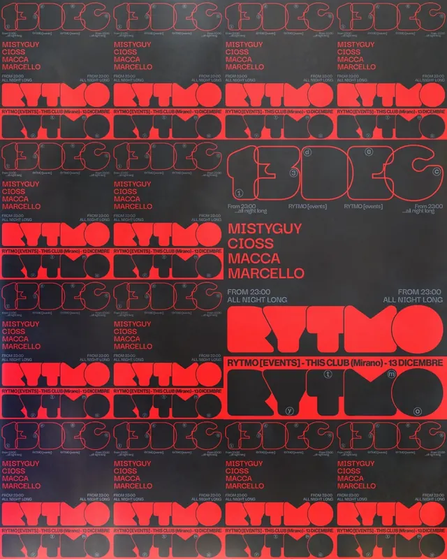
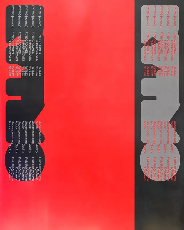
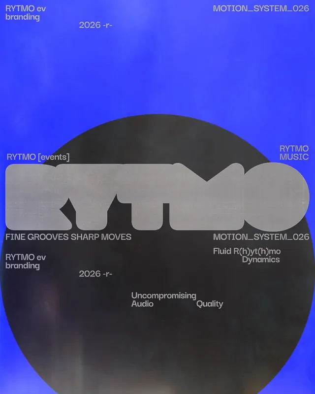
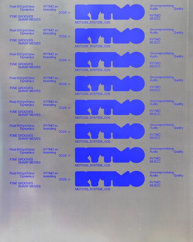
Visual identity for Rytmo, an independent music and events project, featuring custom lettering and a pictogram rooted in funk and early Chicago house aesthetics, presented across nine slides with brand applications, type studies, and environmental installations in bold red and black.

Summary
A visual identity system for Rytmo, an independent music and events project, built on custom letterforms and a fluid pictogram inspired by funk and early Chicago house music. The nine-slide carousel shows the logo as a 3D neon sign installation, branding guidelines, typographic explorations, and color studies centered on bold red and black.
Visual description
The poster reveals a hanging neon sign reading "RYTMO" in red against an industrial ceiling, establishing a street-level, venue-appropriate aesthetic. Subsequent slides show brand documentation: a large red circle with black abstracted letterforms inside (the custom pictogram), labeled with descriptive phrases like "Fluid R(h)yt(h)mo Dynamics," "Fine Grooves Sharp Moves," and "Uncompromising Audio Quality." Type studies display the custom lettering at various sizes and weights. A design system slide shows the pictogram's construction and the tagged trigram-like markers (p), (i), (m), (o) positioned around it, suggesting phonetic or rhythmic structure. Mood boards and collateral studies follow. The palette stays rigorous: vibrant red as the primary color against pure black and white, creating high contrast. Design system annotations use all-caps, monospace footnotes. Event poster mockups show how the identity scales from intimate posters to large-scale installations.
Key takeaway
A pictogram derived from music genre characteristics (funk's fluidity, Chicago house's groove) makes the branding memorable and defensible. Using a single neon installation as the hero image establishes immediate credibility and venue-appropriate positioning. The "uncompromising" language paired with bold color makes the brand feel unapologetic and confident.
Reuse notes
Ideal template for music events, nightlife venues, artist collectives, or creative agencies serving the music industry. The custom lettering and pictogram approach works particularly well when the project has a clear sonic or stylistic root. The red and black palette is iconic and economical to produce across print, digital, and environmental applications. The neon installation strategy is strong for venue visibility and social media. Requires custom type design and motion capability to fully bring the "fluid dynamics" messaging to life.