Preview image. Unlock full-res
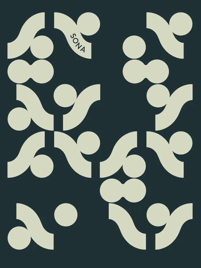
Complete branding system for a Japanese-inspired sauna and social space, featuring a geometric mark with red, teal, and cream palette applied across signage, merchandise, and environmental graphics.

Summary
A vibrant and cohesive brand identity system for SONA, blending Japanese sauna culture with contemporary graphic design. The system centers on a symmetrical geometric mark and extends across environmental signage, merchandise, wayfinding, and member collateral.
Visual description
The carousel showcases a complete design system anchored by a symmetrical mark composed of curved and circular forms in the primary red, with "SONA SOCIAL CLUB" text positioned along the edges. Color explorations include beige/cream, teal, and light blue backgrounds paired with the mark.
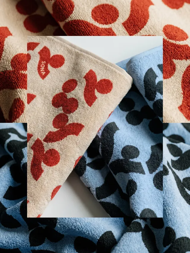
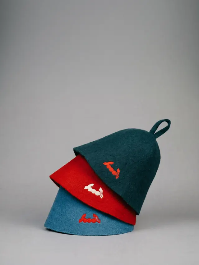
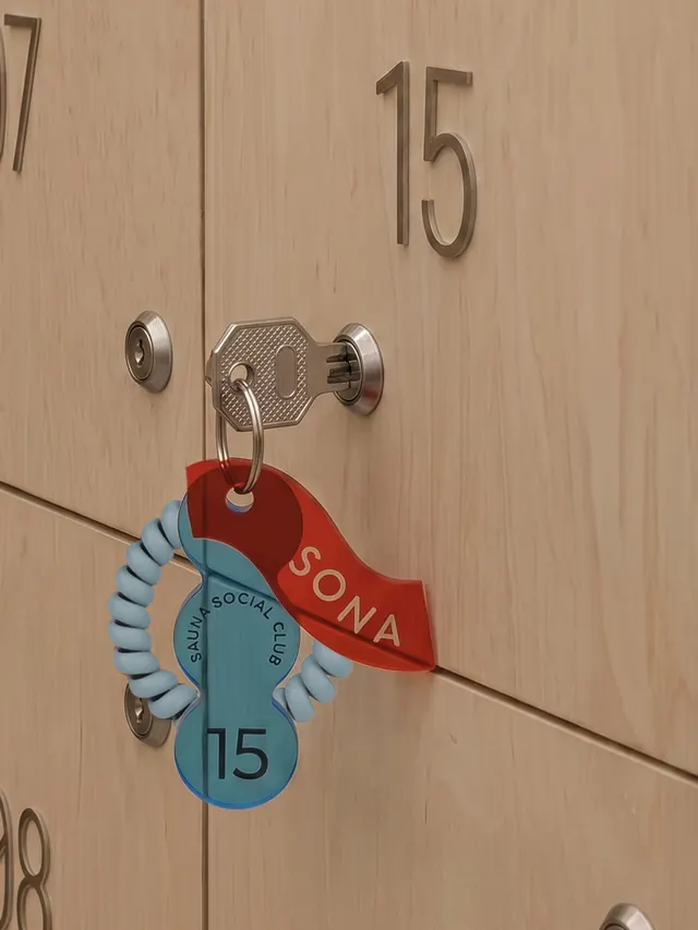
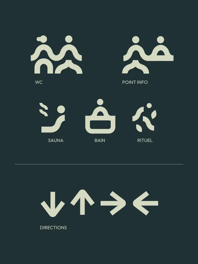
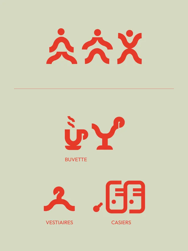
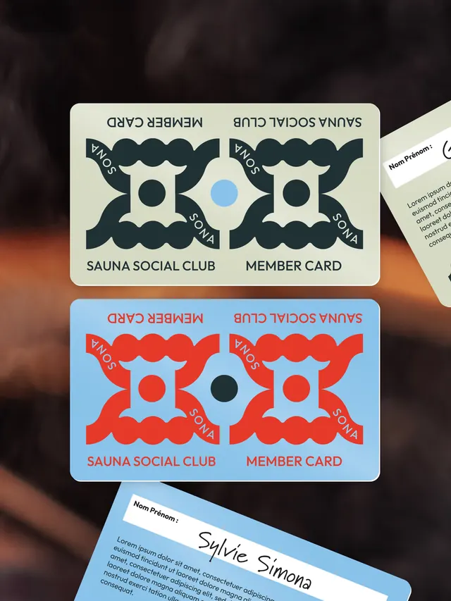
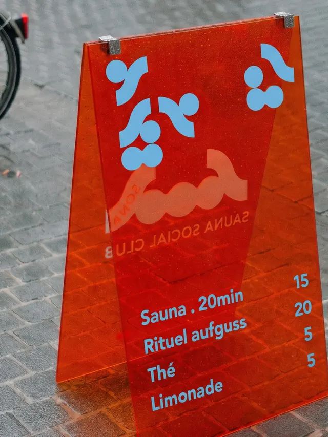
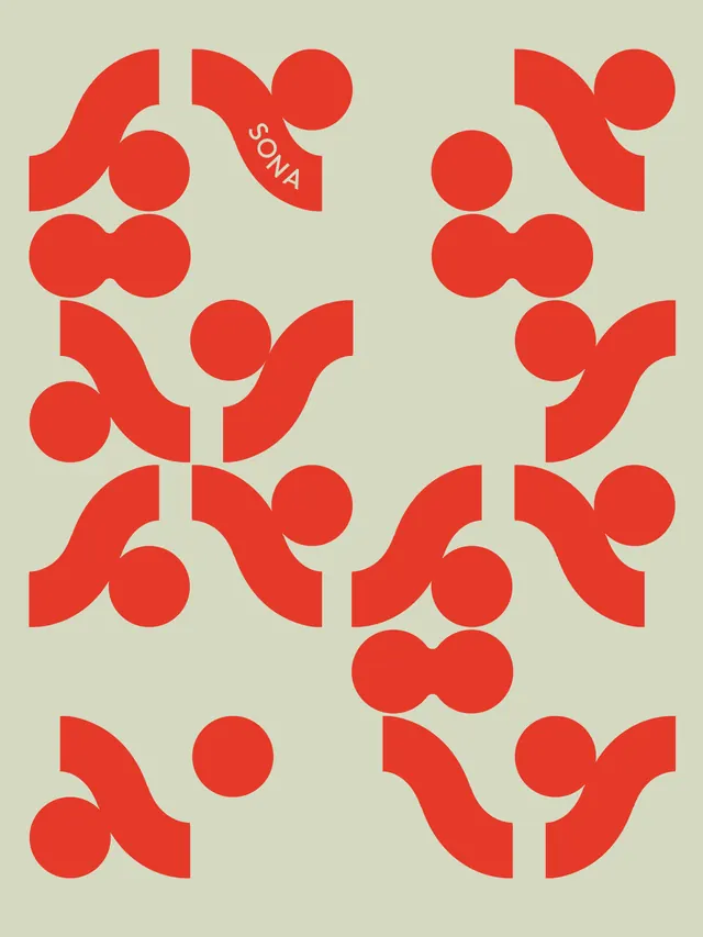
Tangible applications span: woven textile products (towels displaying the repeating circular pattern in red and cream), stacked sauna hats in coordinated red, teal, and blue colorways with the embroidered mark, and metal locker key tags in corresponding brand colors. Wayfinding graphics use a minimalist icon system (silhouettes of figures in pools and saunas, directional arrows, functional zones labeled WC, POINT INFO, SAUNA, BAIN, RITUEL) in cream against dark navy backgrounds. Member cards and packaging display the mark in different colorways (dark and red on cream, cream on light blue, cream on dark navy). A folded menu card in bright red lists sauna duration, rituals, beverages, and pricing. Throughout, a repeating tile pattern of the mark fills backgrounds in alternating color schemes, creating visual coherence and rhythm.
Key takeaway
The system's strength lies in its scalability from large environmental graphics down to intimate product details, unified through the distinctive geometric mark and disciplined three-color palette. The design successfully translates Japanese bath-house warmth and ritual into modern graphic language by balancing geometric precision with organic curves.
Reuse notes
Highly relevant for hospitality and wellness branding, especially social or community-focused spaces. The system demonstrates how a single mark can anchor both practical wayfinding and premium product design. The color contrast (warm red against cool teal) reinforces the hot/cold sauna experience conceptually. Works well for venues that want to balance sophisticated minimalism with friendly, inviting energy.