Preview image. Unlock full-res
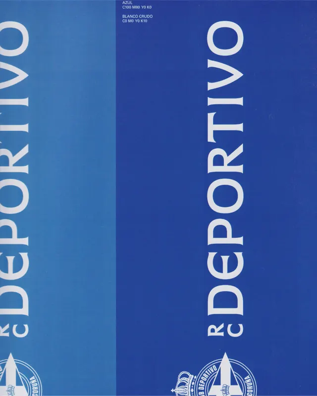
A 7-slide carousel revealing the new identity system for RC Deportivo, a Spanish football club, with refined geometric branding, monogram redesign, and applied collateral moments.

Summary
RC Deportivo's new brand identity system, shown across 7 slides from primary mark through application. The redesign modernizes the club's legacy with geometric refinement, a revised monogram, and a cohesive color system applied to posters, match graphics, and team lineups.
Visual description
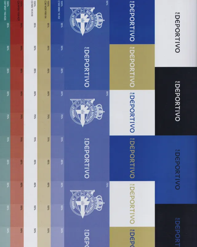
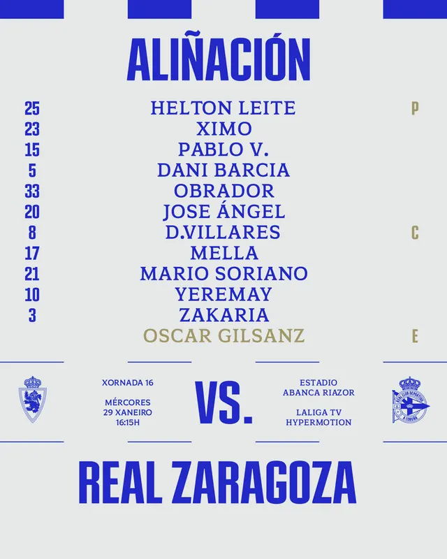
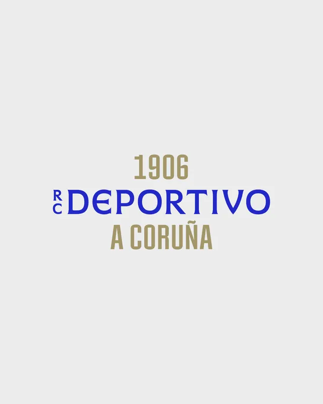
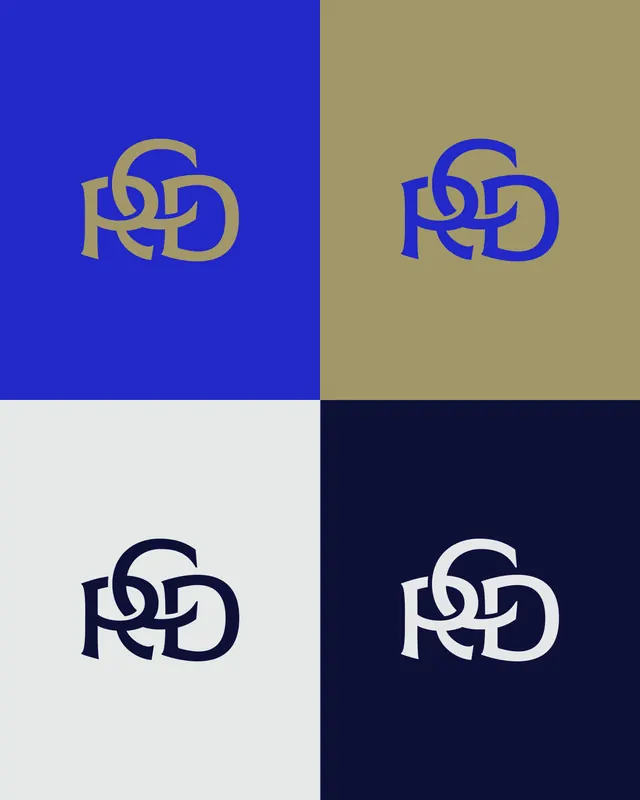
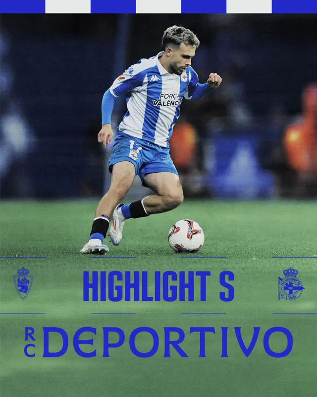
Primary brand color is a rich navy blue throughout, paired with white and bright sky blue accents. The redesigned mark appears monumental on the opening slides - vertical wordmark "RC DEPORTIVO" rendered in clean, geometric sans-serif, refined proportions. The historic club crest and geometric shield elements are reinterpreted with sharper angles and simplified forms. The carousel progresses to application: vertical brand lockup, color swatch system (showing Azul and Blanco Crudo options), match-day posters featuring team lineups, stadium graphics, and photography of the club stadium. Typography is all-caps throughout, creating a bold, authoritative presence. The design system is clearly demonstrated through repeated application across different mediums.
Key takeaway
A sports rebrand works best when it honors legacy (the shield, the colors) while modernizing execution (sharper proportions, cleaner geometry). Showing the mark alone first, then in context, then applied to real match scenarios, builds credibility and scale. The tight color palette (navy + white + bright blue) ensures reproduction works across print and digital.
Reuse notes
Excellent case study for sports club rebrands, legacy organization modernization, and geometric identity systems. The application sequence - mark → system → real-world use - is an effective carousel narrative. Useful reference for any brand needing to balance tradition with contemporary design. The geometric simplification approach translates well to other sectors seeking authority and sophistication (corporate, financial, government).
From this post: RC Deportivo football club identity refresh
View post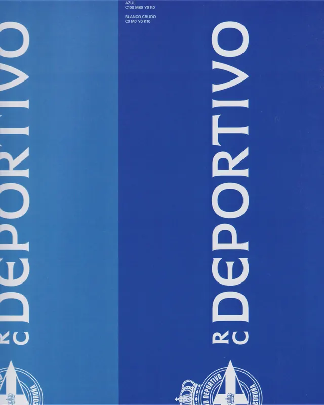
More like this


Keep what you find
A free account saves references to boards and can send you a weekly email of picks based on what you save.
To see every result, go Pro.