
Preview image. Unlock full-res
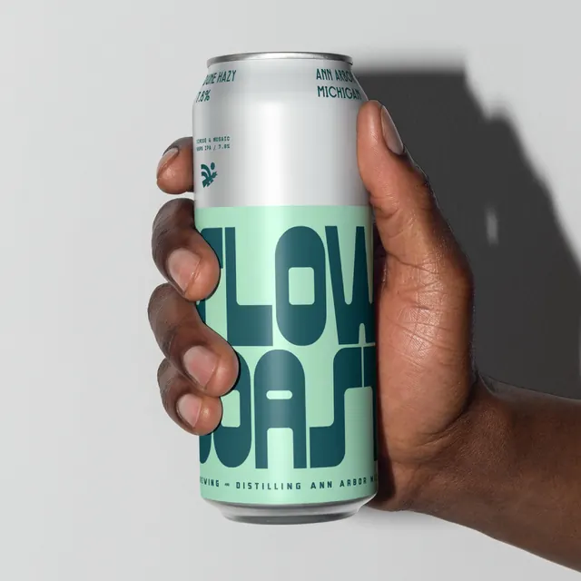
Branding identity exploration for Slow Coast Brewery showing snail logo icon, wordmark, label patterns, and collateral with minimalist line art and refined typography.
Summary
A comprehensive branding system for Slow Coast Brewery built around a distinctive snail logo rendered in clean line art. The carousel explores the mark's application across signage, labels, stationery, and promotional materials with teal/cream and monochromatic color options.
Visual description
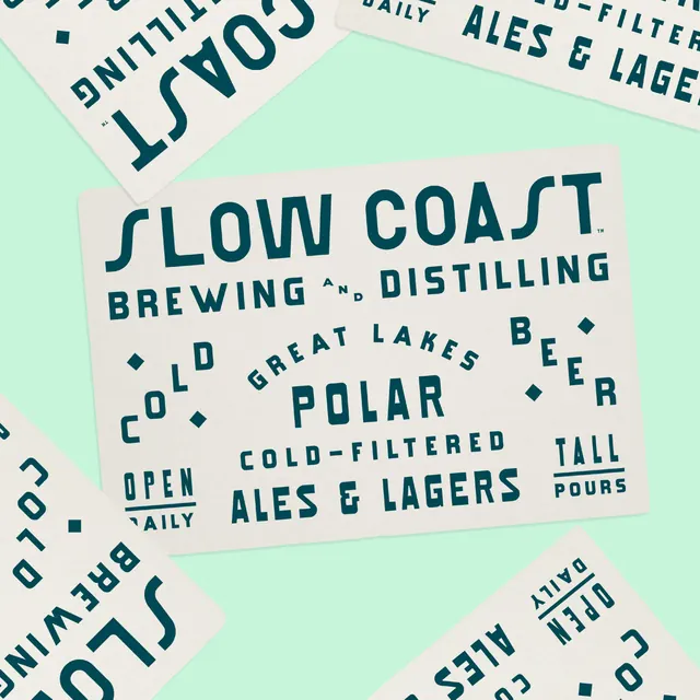
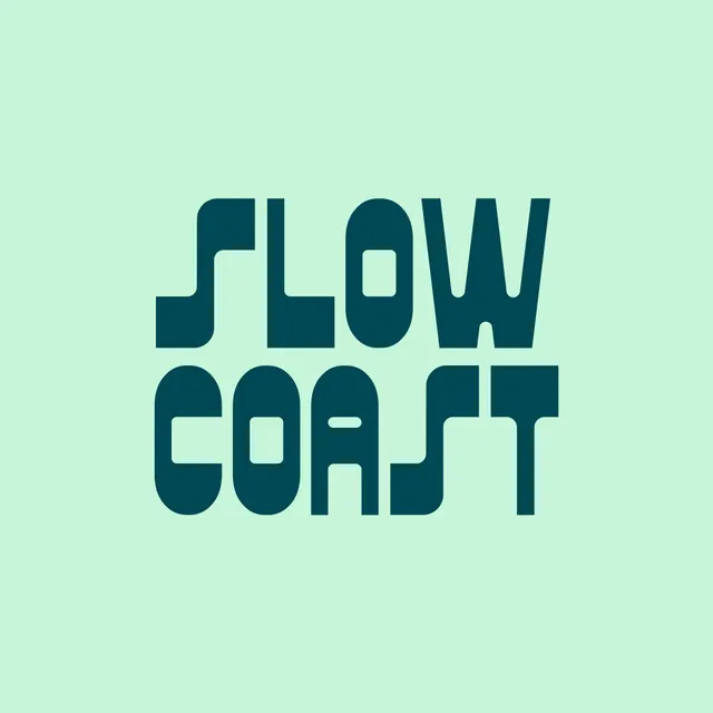
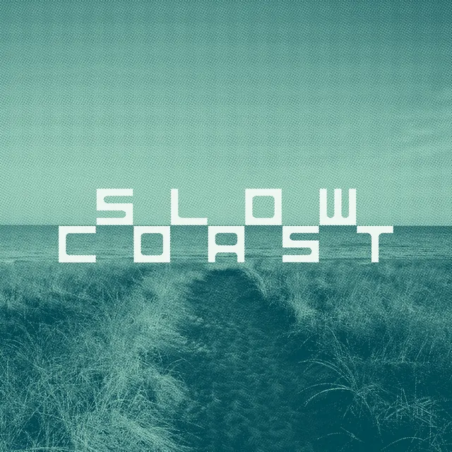
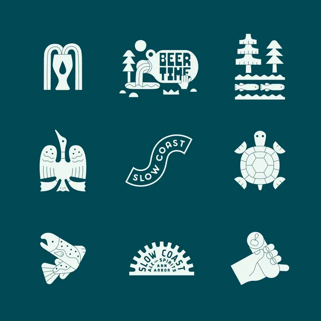
The opening slide features a minimalist white snail silhouette on a teal background with subtle organic curves forming the shell and body. Subsequent slides showcase the wordmark "SLOW COAST" in bold, geometric sans-serif type; product labels on cream and teal background with phrases like "OLD GREAT LAKES BEER", "DAILY ALES & LAGERS", "POLAR COLD-FILTERED"; label sheets showing the snail mark repeated; pattern explorations mixing the snail with geometric shapes and typography; stationery and collateral showing the full identity system. Line art throughout is clean and minimal, using negative space and consistent stroke weight. The color system stays disciplined: deep teal (#1a5f4a) and cream/off-white, avoiding unnecessary variation. Typography is bold and constructed, suggesting slowness and craftsmanship.
Key takeaway
The snail is perfectly chosen: iconic, memorable, on-brand for a slow/craft narrative, and simple enough to scale from small beer labels to large signage. The identity avoids cliche brewery tropes (hops, barrels, script) in favor of geometric precision and conceptual wit. This makes it feel contemporary and designed rather than kitschy.
Reuse notes
Reference for alcohol/hospitality branding that wants to feel premium and modern rather than rustic. The icon-first strategy (let the snail carry the concept) is powerful and reusable for any brand with a natural symbol. Line art at this quality level works across print, digital, and dimensional applications. The teal/cream palette is distinctive without being trend-driven. Best practices here: minimal color palette, consistent mark, strong wordmark, and clear application rules (shown across formats). Scale from tiny labels to large signage without losing clarity.
From this post: Slow Coast Brewing identity system
View post


More like this


Keep what you find
A free account saves references to boards and can send you a weekly email of picks based on what you save.
To see every result, go Pro.